FAQ |
Members List |
Calendar |
Search |
Today's Posts |
![]() |
|
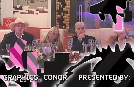
Big Brother Designs (fan made) For all fan-made BB banners, adverts, logos etc. |
Reply |
|
Thread Tools | Display Modes |
![]() |
#1 | |||
|
||||
Senior Member
|
![]() So, what do you's all think? I'll make some extra graphics in a while ![]() |
|||
![]() |
![]() |
![]() |
#2 | |||
|
||||
Senior Member
|
I think it's really good. It has an evil theme to it, which I really like. Would be nice to see it against a plain white background as well.
|
|||
![]() |
![]() |
![]() |
#3 | |||
|
||||
Senior Member
|
Thanks Jack! Your right about the evil element. I gave it sharp edges and cold colours for the 'Evil' effect.
Here it is on a white background: ![]() |
|||
![]() |
![]() |
![]() |
#4 | ||
|
|||
Senior Moment
|
I like it, well done
![]() |
||
![]() |
![]() |
![]() |
#5 | |||
|
||||
Senior Member
|
I prefer it against the white background. It looks so much crisper. Great eye
![]() |
|||
![]() |
![]() |
![]() |
#6 | |||
|
||||
Senior Member
|
Thanks again for comenting everyone!
![]() |
|||
![]() |
![]() |
![]() |
#7 | ||
|
|||
Senior Member
|
Wow that is one nice eye!
![]() ![]() |
||
![]() |
![]() |
![]() |
#8 | ||
|
|||
Senior Member
|
It's different, I like the colours and the shape
|
||
![]() |
![]() |
![]() |
#9 | |||
|
||||
Piertotum Locomotor
|
I really like it. It's very effective up against the real eye in the backround. Good job [:
|
|||
![]() |
![]() |
![]() |
#10 | |||
|
||||
Senior Member
|
Thanks for the great comments everyone!
|
|||
![]() |
![]() |
![]() |
#11 | ||
|
|||
Senior Member
|
Yes I Do Like That Conor Great Work Mate On That One
![]() |
||
![]() |
![]() |
![]() |
#12 | |||
|
||||
Senior Member
|
Glad you like it Ann!
![]() |
|||
![]() |
![]() |
![]() |
#13 | |||
|
||||
Senior Member
|
Here are a few extra things:
Billboard: ![]() End titles: (V1) ![]() Housemate Profile: ![]() Live bar: ![]() Time bar: ![]() More to come soon! |
|||
![]() |
![]() |
![]() |
#14 | ||
|
|||
Senior Member
|
wow! They are really good
|
||
![]() |
![]() |
![]() |
#15 | |||
|
||||
Senior Member
|
Thanks Spike!
![]() |
|||
![]() |
![]() |
![]() |
#16 | ||
|
|||
Senior Member
|
wow They Are Fab
![]() |
||
![]() |
![]() |
![]() |
#17 | |||
|
||||
Senior Member
|
Thanks Ann!
![]() |
|||
![]() |
![]() |
![]() |
#18 | |||
|
||||
Senior Member
|
Truly amazing, absolutely fantastic!
A lot of effort has been put into that, you can tell. The time paid off. A.m.a.z.i.n..g.! |
|||
![]() |
![]() |
![]() |
#19 | |||
|
||||
Senior Member
|
Quote:
It looks good, though I don't really like the concept of an all-black eye. |
|||
![]() |
![]() |
![]() |
#20 | ||
|
|||
Senior Moment
|
I like em!
|
||
![]() |
![]() |
![]() |
#21 | |||
|
||||
Senior Member
|
Once again, thanks for all the comments!
Coming up next, Website/advertising |
|||
![]() |
![]() |
![]() |
#22 | ||
|
|||
Senior Member
|
I think the time and lives are much too big. But very nice. Don't bump as much.
![]() |
||
![]() |
![]() |
![]() |
#23 | |||
|
||||
Senior Member
|
Basicly, this is the C4 official homepage:
![]() And a Teaser ad: ![]() More soon, and thanks for commenting! ![]() |
|||
![]() |
![]() |
![]() |
#24 | |||
|
||||
Senior Member
|
^ Anyone like these? It took ages to make them lol
![]() ![]() |
|||
![]() |
![]() |
![]() |
#25 | ||
|
|||
Nah
|
The graphics are a little too big but overall, I like it: simple, chic and modern.
|
||
![]() |
![]() |
Reply |
|
|