| FAQ |
| Members List |
| Calendar |
| Search |
| Today's Posts |
|
|


Site Navigation
| Big Brother Designs (fan made) For all fan-made BB banners, adverts, logos etc. |
| Reply |
|
|
Thread Tools | Display Modes |
|
|
| Big Brother Designs (fan made) For all fan-made BB banners, adverts, logos etc. |
| Reply |
|
|
Thread Tools | Display Modes |
 08-01-2009, 10:53 AM
|
#1 | ||
|
|||
|
Senior Member
|
Here are MY attemps at a new BB10 Logos!
Lemme know what you think, seeing as im still new to all this =) ive named this design S Q U A R E E Y E D !  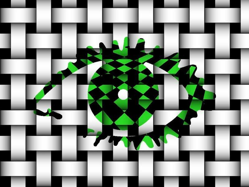  :t ongue::ton gue: :t ongue::ton gue:
|
||

|
 Reply With Quote Reply With Quote
|
|
08-01-2009, 10:58 AM
|
#2 | |||
|
||||
|
CLOSE EM!
|
These designs would not go for BB10 there just to tacky the animations are ok and you can see your running out of ideas.
|
|||
|
|
Reply With Quote
|
|
08-01-2009, 11:06 AM
|
#3 | ||
|
|||
|
Senior Member
|
Quote:
bit harsh like and tbh theres ALOT worse out there that people post n they dont get comments like that! and would anyone have guessed the bb9 logo would be what it was? they tend to be quite simple and include block colour. hence where my idea came from and more often that not its more of a pattern than some of the things people are posting which get called "amazing" |
||
|
|
Reply With Quote
|
|
08-01-2009, 11:08 AM
|
#4 | |||
|
||||
|
CLOSE EM!
|
Quote:
|
|||
|
|
Reply With Quote
|
|
08-01-2009, 11:20 AM
|
#5 | ||
|
|||
|
Senior Member
|
no you didnt give ur opinion, u passed judgement, there is a difference.
if you was giving ur opinion, you would not say things like "there just to tacky"... thats was just taking the p**s outta what i did |
||
|
|
Reply With Quote
|
|
08-01-2009, 04:38 PM
|
#6 | ||
|
|||
|
Adios
|
Quote:
|
||
|
|
Reply With Quote
|
|
08-01-2009, 04:40 PM
|
#7 | ||
|
|||
|
Senior Member
|
I love the animation but not the eyes.
|
||
|
|
Reply With Quote
|
|
08-01-2009, 04:44 PM
|
#8 | |||
|
||||
|
Altar Ego
|
I think Samuels logo > Glenns actualy. PJ, I have no idea where you got the idea that he was running out of ideas. Do you live with the guy? Are you in his brain trust?
The only thing I will say, IMO, is that it is too simmilar to the overall style of Big Brother 8, with the blocs and the extravagent colours. |
|||
|
|
Reply With Quote
|
|
08-01-2009, 04:45 PM
|
#9 | |||
|
||||
|
Piertotum Locomotor
|
I don't like it.
|
|||
|
|
Reply With Quote
|
|
08-01-2009, 09:29 PM
|
#10 | |||
|
||||
|
Senior Member
|
i think if it was a repetative pattern, and the coloured blocks were randomly coloured, it could look better
but i like the animation 
|
|||
|
|
Reply With Quote
|
|
09-01-2009, 12:15 AM
|
#11 | ||
|
|||
|
Senior Member
|
oh well i like it n thats all that matters lol
i do proper like the idea of squares tho, but maybe if it was a bit different |
||
|
|
Reply With Quote
|
|
09-01-2009, 12:26 AM
|
#12 | ||
|
|||
|
Adios
|
Quote:
|
||
|
|
Reply With Quote
|
|
09-01-2009, 12:31 AM
|
#13 | |||
|
||||
|
Senior Member
|
well I like it
well done, the animation's amazing |
|||
|
|
Reply With Quote
|
|
09-01-2009, 01:32 AM
|
#14 | ||
|
|||
|
Senior Member
|
Quote:
|
||
|
|
Reply With Quote
|
|
09-01-2009, 02:09 AM
|
#15 | |||
|
||||
|
Adios
|
Quote:
|
|||
|
|
Reply With Quote
|
|
09-01-2009, 05:19 AM
|
#16 | ||
|
|||
|
Senior Member
|
i know they're completely different forums... im new to the eye thing NOT this forum lol
but i was comparing them, the people on digitalspy can be pretty horrible and so can people on here sometimes... its a shame though really as people dont come on here to get the p**S took out of them. ahhh well... thats enough deep and meaningful for me lol =) |
||
|
|
Reply With Quote
|
| Reply |
|
|


 Linear Mode

