| FAQ |
| Members List |
| Calendar |
| Search |
| Today's Posts |
|
|


Site Navigation
| Big Brother Designs (fan made) For all fan-made BB banners, adverts, logos etc. |
| Reply |
|
|
Thread Tools | Display Modes |
|
|
| Big Brother Designs (fan made) For all fan-made BB banners, adverts, logos etc. |
| Reply |
|
|
Thread Tools | Display Modes |
 28-10-2007, 06:24 PM
|
#51 | |||
|
||||
|
GetReadyToFly
|
It looks tons better now, it has nicer colours.
|
|||

|
 Reply With Quote Reply With Quote
|
|
28-10-2007, 06:30 PM
|
#52 | ||
|
|||
|
Senior Member
|
The green and yellow one looks all right, but you don't want to base the whole house on the eye...
|
||
|
|
Reply With Quote
|
|
28-10-2007, 06:33 PM
|
#53 | |||
|
||||
|
Senior Member
|
Quote:
Apart from that, weldone! 
|
|||
|
|
Reply With Quote
|
|
28-10-2007, 06:45 PM
|
#54 | ||
|
|||
|
Senior Member
|
Yeah, I think the actual layout doesn't look very Big Brothery.
|
||
|
|
Reply With Quote
|
|
28-10-2007, 08:10 PM
|
#55 | ||
|
|||
|
Senior Member
|
It's not supposed to be Big Brothery, it's different and new. If Big Brother stayed Big Brothery for the next 2 years or however long it is contracted for it would be rubbish that is why my house is not Big Brothery and when I do my week by week plan that won't be Big Brothery.
|
||
|
|
Reply With Quote
|
|
28-10-2007, 08:16 PM
|
#56 | ||
|
|||
|
Senior Member
|
great house!
Love the colour schemes! |
||
|
|
Reply With Quote
|
|
28-10-2007, 09:39 PM
|
#57 | ||
|
|||
|
Senior Member
|
Quote:
|
||
|
|
Reply With Quote
|
|
28-10-2007, 09:47 PM
|
#58 | ||
|
|||
|
Senior Member
|
i think it looks much better now, but can ppl stop talking about it not being big brothery as they try to change the house dramatically every year.
|
||
|
|
Reply With Quote
|
|
28-10-2007, 09:48 PM
|
#59 | |||
|
||||
|
Senior Member
|
Quote:
|
|||
|
|
Reply With Quote
|
|
29-10-2007, 02:57 PM
|
#60 | |||
|
||||
|
Senior Member
|
Quote:
|
|||
|
|
Reply With Quote
|
|
29-10-2007, 04:59 PM
|
#61 | ||
|
|||
|
Senior Member
|
Thanks for all the comments, lounge pics coming up later
|
||
|
|
Reply With Quote
|
|
29-10-2007, 05:01 PM
|
#62 | |||
|
||||
|
ylvis♥
|
Big Brothery.. love it lol
|
|||
|
|
Reply With Quote
|
|
29-10-2007, 05:47 PM
|
#63 | ||
|
|||
|
Senior Member
|
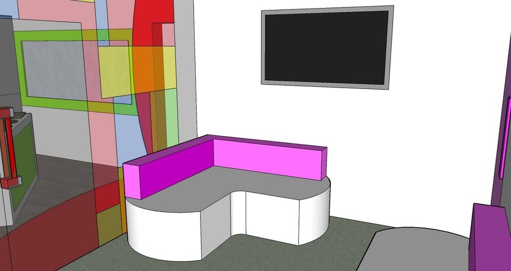
Here are the lounge pics
|
||
|
|
Reply With Quote
|
|
29-10-2007, 06:02 PM
|
#64 | ||
|
|||
|
Nah
|
I like it but maybe it's a bit too little !

|
||
|
|
Reply With Quote
|
|
29-10-2007, 06:06 PM
|
#65 | ||
|
|||
|
Senior Member
|
Quote:
|
||
|
|
Reply With Quote
|
|
29-10-2007, 07:24 PM
|
#66 | ||
|
|||
|
Senior Member
|
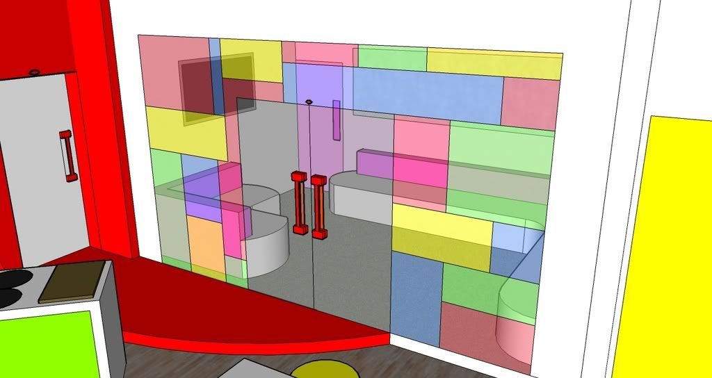
I like the design, I think you need to put more detail in.
|
||
|
|
Reply With Quote
|
|
29-10-2007, 07:45 PM
|
#67 | |||
|
||||
|
GetReadyToFly
|
I like those mosiac typa tiles on the glass going into the living room, the room is small but it has what it needs in there.
|
|||
|
|
Reply With Quote
|
|
29-10-2007, 07:54 PM
|
#68 | |||
|
||||
|
Senior Member
|
a lil more detail
|
|||
|
|
Reply With Quote
|
|
31-10-2007, 05:58 PM
|
#69 | ||
|
|||
|
Senior Member
|
Thanks for all the comments
Here are the dining area pics 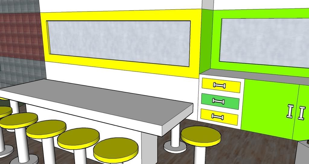 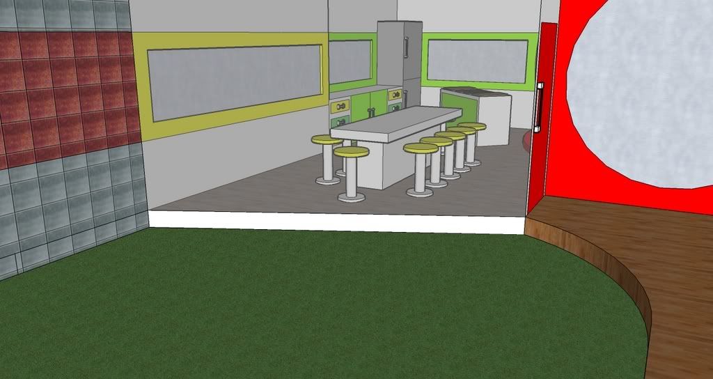
|
||
|
|
Reply With Quote
|
|
31-10-2007, 06:15 PM
|
#70 | |||
|
||||
|
Senior Member
|
Sorry Spike but I prefer your last kitchen/dining area...
|
|||
|
|
Reply With Quote
|
|
31-10-2007, 06:19 PM
|
#71 | |||
|
||||
|
ylvis♥
|
Quote:
I don't like it =\... ah well.. |
|||
|
|
Reply With Quote
|
|
01-11-2007, 03:15 PM
|
#72 | ||
|
|||
|
Senior Member
|
Thanks for all the comments everyone, I've decided to not carry on with this house for two reasons
1. I've got a lot of coursework and exam revision to do over the next few weeks 2. Most of the comments have been negative so that obviously means my house isn't very good so there is no point in adding to a bad design |
||
|
|
Reply With Quote
|
|
02-11-2007, 07:46 PM
|
#73 | |||
|
||||
|
ylvis♥
|
Yes.. you got to work hard to get higher than that D...

|
|||
|
|
Reply With Quote
|
| Reply |
|
|


 Linear Mode

