| FAQ |
| Members List |
| Calendar |
| Search |
| Today's Posts |
|
|


Site Navigation
| Big Brother Designs (fan made) For all fan-made BB banners, adverts, logos etc. |
| Reply |
|
|
Thread Tools | Display Modes |
|
|
| Big Brother Designs (fan made) For all fan-made BB banners, adverts, logos etc. |
| Reply |
|
|
Thread Tools | Display Modes |
 30-01-2008, 03:02 PM
|
#51 | ||
|
|||
|
Senior Member
|
Quote:

|
||

|
 Reply With Quote Reply With Quote
|
|
30-01-2008, 03:56 PM
|
#52 | ||
|
|||
|
Senior Member
|
I dont like it tbh, the only idea that i like is the silohuettes (i know its spelt wrong) of the housemates however i would hsve used that design feature in a different way.
Sorry but thats just my honest opinion. |
||
|
|
Reply With Quote
|
|
30-01-2008, 03:59 PM
|
#53 | |||
|
||||
|
Senior Member
|
love the house guys !!

|
|||
|
|
Reply With Quote
|
|
30-01-2008, 04:00 PM
|
#54 | ||
|
|||
|
Senior Member
|
Quote:
|
||
|
|
Reply With Quote
|
|
30-01-2008, 04:03 PM
|
#55 | ||
|
|||
|
Senior Member
|
Quote:
|
||
|
|
Reply With Quote
|
|
30-01-2008, 05:00 PM
|
#56 | ||
|
|||
|
Senior Member
|
more pics coming tonight
|
||
|
|
Reply With Quote
|
|
30-01-2008, 05:02 PM
|
#57 | |||
|
||||
|
Senior Member
|
Quote:

|
|||
|
|
Reply With Quote
|
|
30-01-2008, 05:47 PM
|
#58 | ||
|
|||
|
Senior Member
|
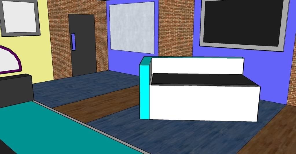
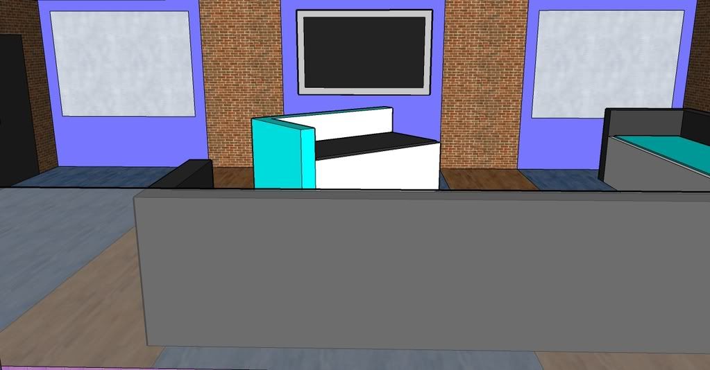
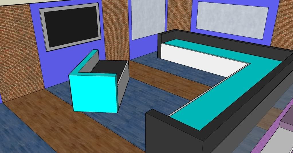
Lounge pics
|
||
|
|
Reply With Quote
|
|
30-01-2008, 05:59 PM
|
#59 | ||
|
|||
|
Senior Member
|
Im really not that keen on it, the colours are way to bright, i think they need to be toned down a bit imo.
|
||
|
|
Reply With Quote
|
|
30-01-2008, 06:03 PM
|
#60 | |||
|
||||
|
Senior Member
|
i see where your coming from.. but i think it needs abit more time and detail..
|
|||
|
|
Reply With Quote
|
|
30-01-2008, 06:05 PM
|
#61 | |||
|
||||
|
Senior Member
|
well thanks for being honest.
|
|||
|
|
Reply With Quote
|
|
30-01-2008, 06:59 PM
|
#62 | ||
|
|||
|
Senior Member
|
Thanks for the honest comments.
Anyone else want to post their thoughts about this house? |
||
|
|
Reply With Quote
|
|
30-01-2008, 07:02 PM
|
#63 | ||
|
|||
|
Senior Member
|
As KRAIG said it needs more detail, e.g look at sketchup houses such as conor.
Its really good considering that its both of your imputs. I hope im not being too harsh. |
||
|
|
Reply With Quote
|
|
30-01-2008, 07:08 PM
|
#64 | |||
|
||||
|
Senior Member
|
Quote:
the rest of the house will be better we hope..? lol |
|||
|
|
Reply With Quote
|
|
30-01-2008, 07:11 PM
|
#65 | ||
|
|||
|
Banned
|
I really like the original brick wall inside bit, but I was slightly dissapointed with the Living Room!
Great Work though! |
||
|
|
Reply With Quote
|
|
30-01-2008, 07:23 PM
|
#66 | |||
|
||||
|
Senior Member
|
tis well gd guys, but i agree the livivng area doesn't have a very "living" feel to it? if that makes sence, it's supopsed to be inviting...
|
|||
|
|
Reply With Quote
|
|
30-01-2008, 07:31 PM
|
#67 | |||
|
||||
|
Senior Member
|
well its very very simple but as the house goes on it should get better
 
|
|||
|
|
Reply With Quote
|
|
31-01-2008, 03:04 PM
|
#68 | ||
|
|||
|
Senior Member
|
Thanks for the comments so far everyone
Would anyone else like to comment? |
||
|
|
Reply With Quote
|
|
31-01-2008, 03:11 PM
|
#69 | |||
|
||||
|
Senior Member
|
Quote:
I think the house certainly looks interesting, especially the living room, and Im looking farward too seeing the whole main area, so I can get a rough layout in my head lol Anyway, Good work! (I just wouldnt use the really light blues and purples, especially with the brick) |
|||
|
|
Reply With Quote
|
|
31-01-2008, 03:27 PM
|
#70 | ||
|
|||
|
Senior Member
|
Thanks Conor
|
||
|
|
Reply With Quote
|
|
31-01-2008, 06:21 PM
|
#71 | ||
|
|||
|
Senior Member
|
More pics coming soon
|
||
|
|
Reply With Quote
|
|
31-01-2008, 06:23 PM
|
#72 | ||
|
|||
|
Senior Member
|
I like it but I don't think the colours really match. Nice though!
|
||
|
|
Reply With Quote
|
|
31-01-2008, 07:20 PM
|
#73 | |||
|
||||
|
Senior Member
|
The Kitchen
The kitchen is yellow and purple! Very Bright! 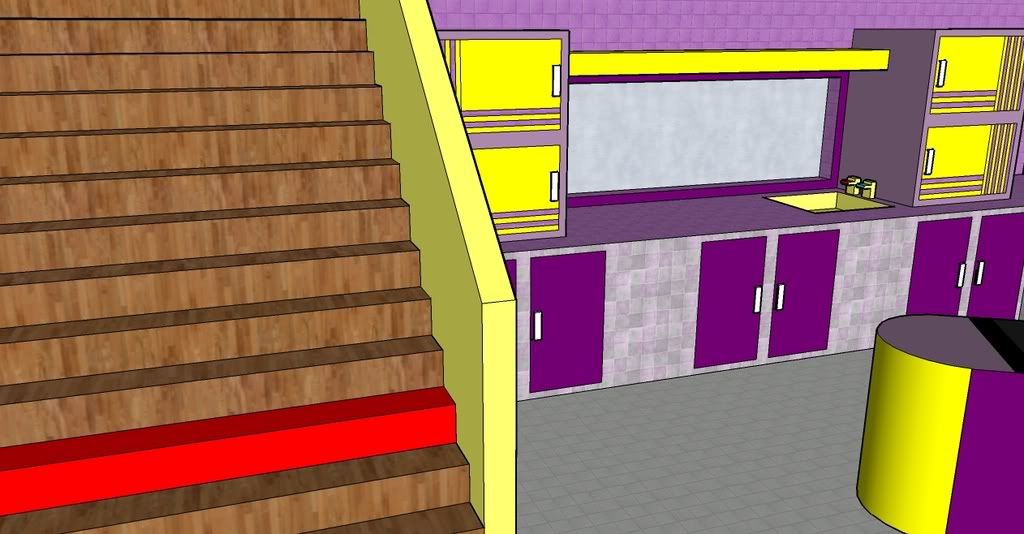 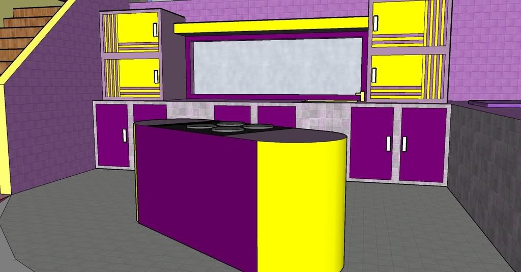 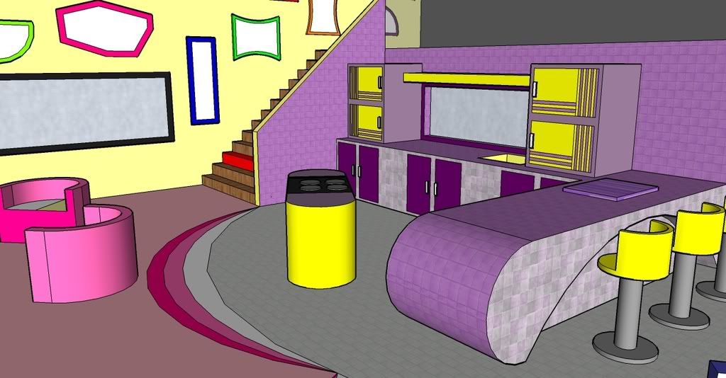 Please Coment Thanks
|
|||
|
|
Reply With Quote
|
|
31-01-2008, 07:32 PM
|
#74 | |||
|
||||
|
Senior Member
|
I LOVE the kitchen!!! It's gorgeous! the colours really suit and it's a good size.
this deserves an elephant.. 
|
|||
|
|
Reply With Quote
|
|
31-01-2008, 07:41 PM
|
#75 | ||
|
|||
|
Senior Member
|
Wow. Now that is nice
Best part so far!
|
||
|
|
Reply With Quote
|
| Reply |
|
|


 Linear Mode

