| FAQ |
| Members List |
| Calendar |
| Search |
| Today's Posts |
|
|


Site Navigation
| Big Brother Designs (fan made) For all fan-made BB banners, adverts, logos etc. |
| Reply |
|
|
Thread Tools | Display Modes |
|
|
| Big Brother Designs (fan made) For all fan-made BB banners, adverts, logos etc. |
| Reply |
|
|
Thread Tools | Display Modes |
 13-02-2008, 03:35 PM
|
#1 | |||
|
||||
|
Senior Member
|
I have been working on a masterplan of a new house lately, and I've decided rather than being a selfish miser I'll post it on Wedensday (Which unless I slept through the last day would be correct) So here it is, Conors New BB house!! Yeah... oh!
(PS, I would be grateful if someone did inform me if it is now Thursday and have slept through Wedensday lol :P) Eye:  Stage/arena pics: 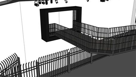 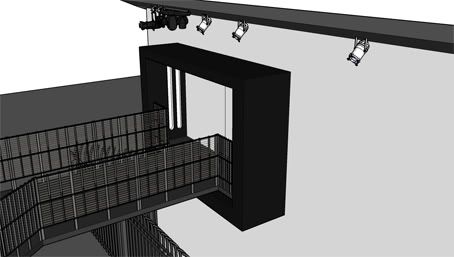 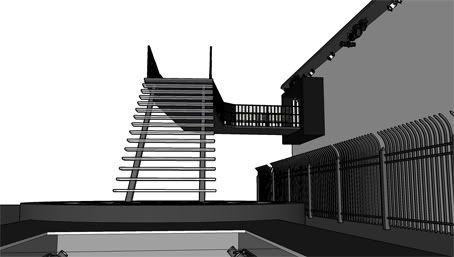 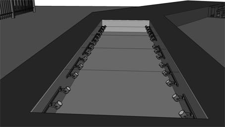 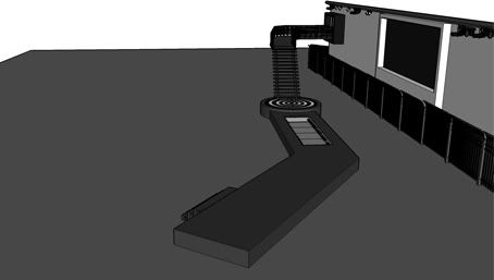 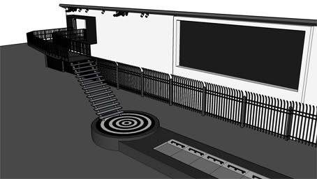 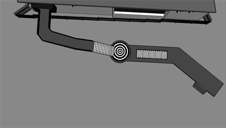
|
|||

|
 Reply With Quote Reply With Quote
|
|
13-02-2008, 03:37 PM
|
#2 | ||
|
|||
|
Senior Member
|
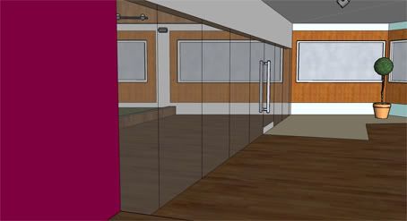
What the heck is that indented bit with the lights? on the walkway..
|
||
|
|
Reply With Quote
|
|
13-02-2008, 03:40 PM
|
#3 | |||
|
||||
|
Senior Member
|
Thats a new feature. You walk over the glass panel and there are lots of multi coloured lights underneath. I honesty only put it in to make the stage look a bit more lively lol
|
|||
|
|
Reply With Quote
|
|
13-02-2008, 03:40 PM
|
#4 | |||
|
||||
|
Senior Member
|
I really don't like the eye but the outside is probably the best outside of a house you've done so far.

|
|||
|
|
Reply With Quote
|
|
13-02-2008, 03:43 PM
|
#5 | |||
|
||||
|
Senior Member
|
Thanks Jack
 I don't really like the eye myself. I was going to use the 'demented' eye instead, hence the stage colours lol but at the last minute I decided I'd work on a custom house to fit with the theme. I might actually re-do that 'eye' I don't really like the eye myself. I was going to use the 'demented' eye instead, hence the stage colours lol but at the last minute I decided I'd work on a custom house to fit with the theme. I might actually re-do that 'eye'
|
|||
|
|
Reply With Quote
|
|
13-02-2008, 03:55 PM
|
#6 | ||
|
|||
|
Senior Member
|
I like it. I always think the outside is the weakest part of your houses but I like this one. Great work
|
||
|
|
Reply With Quote
|
|
13-02-2008, 04:29 PM
|
#7 | |||
|
||||
|
Senior Member
|
Glad its likable enough Spike
 Thanky you for all the comments ppl! 
|
|||
|
|
Reply With Quote
|
|
13-02-2008, 04:34 PM
|
#8 | ||
|
|||
|
Senior Member
|
Quote:
|
||
|
|
Reply With Quote
|
|
13-02-2008, 05:52 PM
|
#9 | |||
|
||||
|
Senior Member
|
I have to agree there lol:
The stairs: 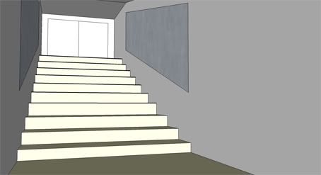 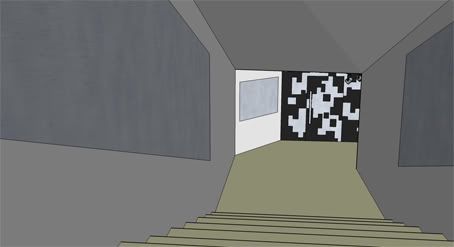 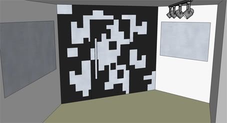 Points: - First looks can be decieving... |
|||
|
|
Reply With Quote
|
|
13-02-2008, 05:58 PM
|
#10 | |||
|
||||
|
Senior Member
|
nice! but the stairs on the outside are a little dangerous lol but great love it!
|
|||
|
|
Reply With Quote
|
|
13-02-2008, 06:05 PM
|
#11 | ||
|
|||
|
Senior Member
|
I like it, especially the pattern on the door and wall.
|
||
|
|
Reply With Quote
|
|
13-02-2008, 06:22 PM
|
#12 | |||
|
||||
|
GetReadyToFly
|
I love the house, the walkways really nice, its a awesome house so far.
|
|||
|
|
Reply With Quote
|
|
13-02-2008, 06:44 PM
|
#13 | |||
|
||||
|
Senior Member
|
Thanks for all the poss comments everyone!
I'll post the dining area next 
|
|||
|
|
Reply With Quote
|
|
14-02-2008, 02:54 AM
|
#14 | |||
|
||||
|
Senior Member
|
Looks good Conor, but I think the door into the house is slightly reminiscent of the BB7 staircase?
|
|||
|
|
Reply With Quote
|
|
14-02-2008, 03:50 AM
|
#15 | |||
|
||||
|
Member
|
Quote:
|
|||
|
|
Reply With Quote
|
|
14-02-2008, 12:28 PM
|
#16 | |||
|
||||
|
Senior Member
|
i really like it and it has been designed so well
i have been trying to use sketch up for the past month on a house and have got nowhere if i ever get to do as well as you have i will be shocked at myself! |
|||
|
|
Reply With Quote
|
|
14-02-2008, 05:48 PM
|
#17 | |||
|
||||
|
Senior Member
|
Matt - Your right lol
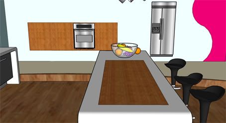
Geoking66 - Thanks again for more great lighting advice I guess the colours are a bit bland looking back lolBarbie-Big-Bro - Thanks for commenting and practice makes perfect! OK, here's the dining room!!  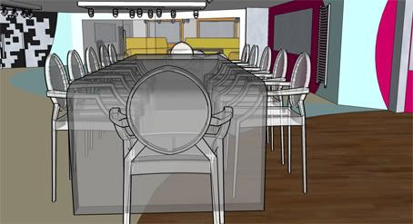 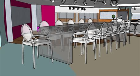 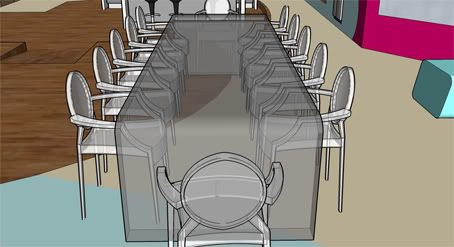 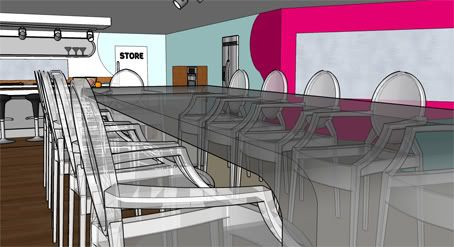 Points: - Pespex heaven! - The table is located in the 'Heart of the house.' - As being made of perspex this room is very uncomfortable. - Credit to Matt for coming up with the 'Swirl' idea on one of the walls
|
|||
|
|
Reply With Quote
|
|
14-02-2008, 06:29 PM
|
#18 | |||
|
||||
|
Senior Member
|
love it! "pespex hevean!" LOVE IT!
|
|||
|
|
Reply With Quote
|
|
14-02-2008, 06:31 PM
|
#19 | |||
|
||||
|
Senior Member
|
Quote:

|
|||
|
|
Reply With Quote
|
|
14-02-2008, 06:54 PM
|
#20 | ||
|
|||
|
Senior Member
|
I Love the table but I don't really like the chairs, sorry.
|
||
|
|
Reply With Quote
|
|
14-02-2008, 06:57 PM
|
#21 | |||
|
||||
|
Senior Member
|
Its OK Spike
But I have to admit I'd have a love affair with these chairs! lol (Joke obviously. Just for the record I do not have Designer chair humping fantasies )
|
|||
|
|
Reply With Quote
|
|
14-02-2008, 09:20 PM
|
#22 | |||
|
||||
|
Senior Member
|
OK, heres the Kitchen
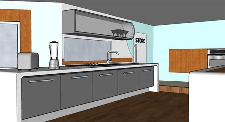 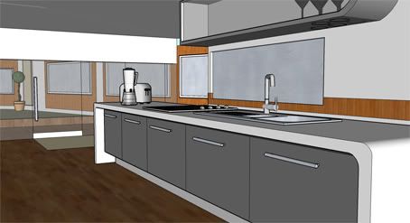  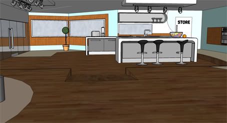 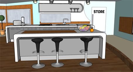 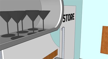  Points: - Its not got any catches. For the first time in years, this si just a normal, straight farward kitchen - The store is right beside the kitchen. - The kitchen is sunk slightly to reach ground level. This is so the garden is accessable without having to have a big step or something like that. - There is a small breakfast bar/island. - And again, credi to Matt for that pink swirl
|
|||
|
|
Reply With Quote
|
|
14-02-2008, 09:57 PM
|
#23 | |||
|
||||
|
Senior Member
|
Anyone like?
|
|||
|
|
Reply With Quote
|
|
14-02-2008, 09:59 PM
|
#24 | |||
|
||||
|
Senior Member
|
LOVE IT!
love the way one stall is at a different angle!!! great work! |
|||
|
|
Reply With Quote
|
|
14-02-2008, 10:27 PM
|
#25 | ||
|
|||
|
Senior Member
|
wow Yes Great Work on That Conor Well Done I Will Give You 10/10 For That One Mate

|
||
|
|
Reply With Quote
|
| Reply |
|
|


 Linear Mode

