| FAQ |
| Members List |
| Calendar |
| Search |
| Today's Posts |
|
|


Site Navigation
| Big Brother Designs (fan made) For all fan-made BB banners, adverts, logos etc. |
| Reply |
|
|
Thread Tools | Display Modes |
|
|
| Big Brother Designs (fan made) For all fan-made BB banners, adverts, logos etc. |
| Reply |
|
|
Thread Tools | Display Modes |
 05-04-2009, 02:51 PM
|
#1 | ||
|
|||
|
Ex Member
|
Another one, why lol?
|
||

|
 Reply With Quote Reply With Quote
|
|
05-04-2009, 03:14 PM
|
#2 | ||
|
|||
|
Adios
|
Quote:
My first project was sort of practise 
|
||
|
|
Reply With Quote
|
|
05-04-2009, 03:16 PM
|
#3 | ||
|
|||
|
Ex Member
|
Great, can't wait.
I've started making a house now too, just finished doing the exterior and stairs. |
||
|
|
Reply With Quote
|
|
05-04-2009, 03:36 PM
|
#4 | ||
|
|||
|
Adios
|
Quote:
|
||
|
|
Reply With Quote
|
|
05-04-2009, 03:59 PM
|
#5 | ||
|
|||
|
Adios
|
OK so first things first- Logo
I wanted to keep it simple but new and fresh 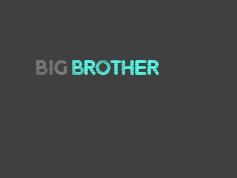 What do you think? EDIT- LOGO IN FIRST POST |
||
|
|
Reply With Quote
|
|
05-04-2009, 04:01 PM
|
#6 | ||
|
|||
|
Senior Member
|
Quote:
|
||
|
|
Reply With Quote
|
|
05-04-2009, 04:30 PM
|
#7 | ||
|
|||
|
Adios
|
An advertising shot
|
||
|
|
Reply With Quote
|
|
05-04-2009, 04:42 PM
|
#8 | ||
|
|||
|
Ex Member
|
Very fresh. It's great but I think you should add a background, just something a little simple.
|
||
|
|
Reply With Quote
|
|
05-04-2009, 04:48 PM
|
#9 | |||
|
||||
|
Senior Member
|
There's new and fresh, and there's boring and basic - and text on a grey background, I'm afraid, is the latter. It's like taking ten steps backward from the current eye logo.

|
|||
|
|
Reply With Quote
|
|
05-04-2009, 07:32 PM
|
#10 | ||
|
|||
|
Adios
|
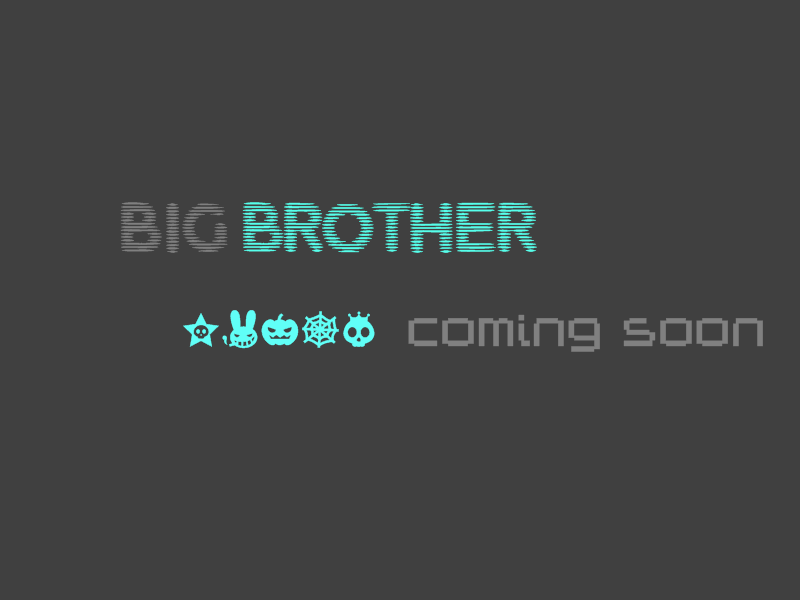
I am working on another alternate logo, which I hope will be better
|
||
|
|
Reply With Quote
|
|
05-04-2009, 08:28 PM
|
#11 | ||
|
|||
|
Adios
|
Ok so I had a little think about what Matt said, and did come to the conclusion that it was a little dull.
So I have made an alternate logo. The only problem is, that someone has told me that it is similar to Conors  I dont want anyone on here thinking I'm trying to mug Conor of his brilliant beyond brilliant ideas, so Ive decided to put them on here, and see what you guys think? 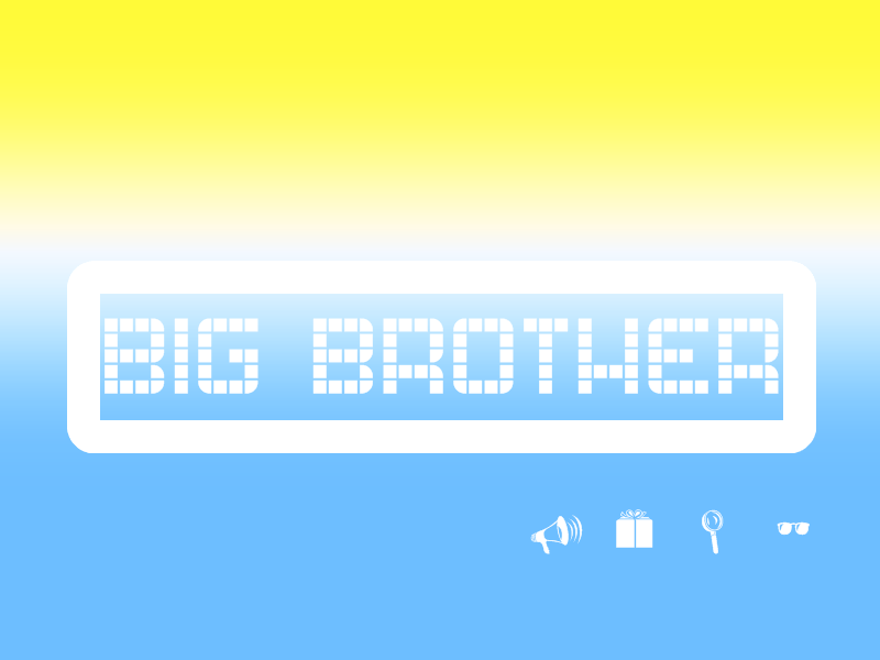 In case you havent noticed  but the inspiration for this design was the BBAUS adverts, which were fantastic. Its something I think would work well here in the UK! but the inspiration for this design was the BBAUS adverts, which were fantastic. Its something I think would work well here in the UK!
|
||
|
|
Reply With Quote
|
|
05-04-2009, 08:35 PM
|
#12 | ||
|
|||
|
Senior Member
|
This is fantastic!
|
||
|
|
Reply With Quote
|
|
05-04-2009, 08:38 PM
|
#13 | |||
|
||||
|
Senior Member
|
I really like the logo actually
I dont think you could work with it much more, it works pretty perfectly as it is atm and opens up a much broader advertising spectrum, and I'm loving the look of the first ad atm. Saying that, you could maybe do something like this for the logo: Soz for hijacking the thread! |
|||
|
|
Reply With Quote
|
|
05-04-2009, 08:38 PM
|
#14 | |||
|
||||
|
Frozen
|
They are good, Keep it up!
|
|||
|
|
Reply With Quote
|
|
05-04-2009, 08:41 PM
|
#15 | ||
|
|||
|
Senior Member
|
Your original was better Glenn - even if not that great on first impressions. It does look far from the finished product, but it seems a much better starting point than your second - and indeed is reminiscent slightly of the original BB1 logo - well, in the positioning on screen at least.
|
||
|
|
Reply With Quote
|
|
05-04-2009, 08:41 PM
|
#16 | ||
|
|||
|
Adios
|
Advertising Campaign
First off, teasers like this will air along side break bumpers. They last for about 5 seconds. 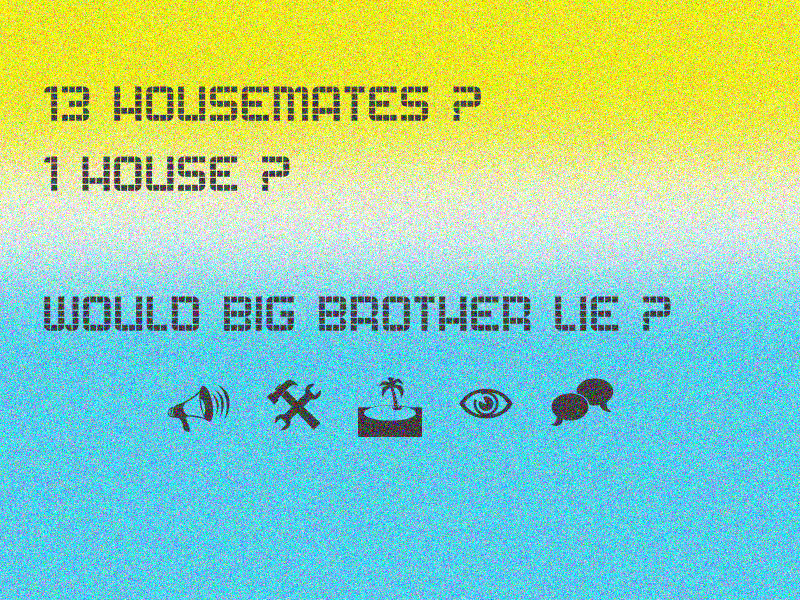 Again with this one, it will last 5 seconds max. 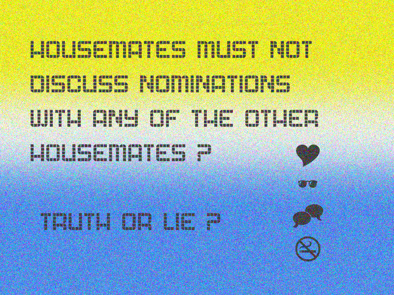 They tease the audience with mudane BB rules, and make you question whether they've changed, or something like that anyway 
|
||
|
|
Reply With Quote
|
|
05-04-2009, 08:43 PM
|
#17 | |||
|
||||
|
Senior Member
|
I really like these! But I think you should change the gradient to grey and pink or something like that anyway, because the colour schemes a bit tacky.
|
|||
|
|
Reply With Quote
|
|
05-04-2009, 08:44 PM
|
#18 | ||
|
|||
|
Adios
|
Quote:
Thanks for the little push And your forgiven for hijacking my thread lol |
||
|
|
Reply With Quote
|
|
05-04-2009, 08:47 PM
|
#19 | ||
|
|||
|
Senior Member
|
You've been watching BB Australia too then! Back to project one would be my advice!
|
||
|
|
Reply With Quote
|
|
05-04-2009, 08:47 PM
|
#20 | ||
|
|||
|
Adios
|
Quote:
|
||
|
|
Reply With Quote
|
|
05-04-2009, 08:48 PM
|
#21 | |||
|
||||
|
Senior Member
|
Quote:

|
|||
|
|
Reply With Quote
|
|
05-04-2009, 08:48 PM
|
#22 | ||
|
|||
|
Adios
|
Quote:
|
||
|
|
Reply With Quote
|
|
05-04-2009, 09:39 PM
|
#23 | ||
|
|||
|
Adios
|
Ok. Im gonna stick with my first logo and the designs that come with it.
Here is the first proper advert cap. The whole thing rotates on itself, but you can stll work out what it says. 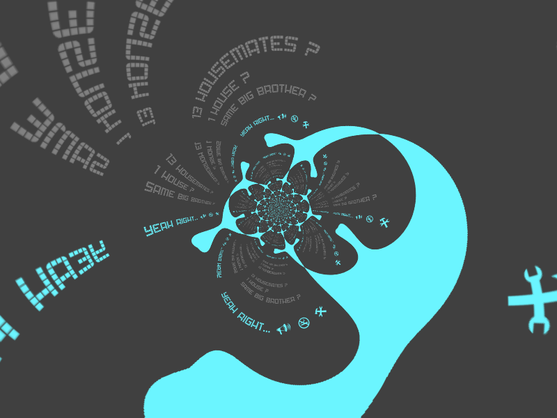
|
||
|
|
Reply With Quote
|
|
05-04-2009, 10:10 PM
|
#24 | |||
|
||||
|
Senior Member
|
i love the screencap!! but im not keen on the idea of losing the eye for the logo, but the screencap is awesome!
|
|||
|
|
Reply With Quote
|
|
05-04-2009, 10:15 PM
|
#25 | ||
|
|||
|
Adios
|
Quote:

|
||
|
|
Reply With Quote
|
| Reply |
|
|


 Linear Mode

