| FAQ |
| Members List |
| Calendar |
| Search |
| Today's Posts |
|
|


Site Navigation
| Big Brother Designs (fan made) For all fan-made BB banners, adverts, logos etc. |
| Reply |
|
|
Thread Tools | Display Modes |
|
|
| Big Brother Designs (fan made) For all fan-made BB banners, adverts, logos etc. |
| Reply |
|
|
Thread Tools | Display Modes |
 07-04-2014, 10:45 PM
|
#1 | |||
|
||||
|
Senior Member
|
I've changed this thread instead of making a new thread, cause i thought i'm going to be designing more and more eyes so instead of making a new thread for each i'm just going to keep them all here..
--------------------------------------------------------------------------------------------- Was randomly looking at patterns to have as a desktop background and i found a pattern online that i thought would work well in the form of a BB eye so i produced this. 
__________________
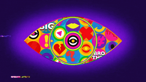 ----------------------------------------------------------------------------- Last edited by Loukas; 14-04-2014 at 10:13 PM. |
|||

|
 Reply With Quote Reply With Quote
|
|
07-04-2014, 11:03 PM
|
#2 | ||
|
|||
|
User banned
|
that cool but it a bit channel 4ish
Last edited by michael21; 07-04-2014 at 11:03 PM. |
||
|
|
Reply With Quote
|
|
07-04-2014, 11:19 PM
|
#3 | ||
|
|||
|
-
|
It's quite good, things you need to improve:
Background- Black doesn't suit this, try another colour or just plain white  Pupil- Needs a bit more definition on the circle of the pupil Other than that, it's a fun eye
|
||
|
|
Reply With Quote
|
|
07-04-2014, 11:20 PM
|
#4 | ||
|
|||
|
-
|
Oh and I'd improve the colour scheme.

|
||
|
|
Reply With Quote
|
|
07-04-2014, 11:22 PM
|
#5 | ||
|
|||
|
User banned
|
Loukas there nothing wrong with the colour i think the black help it stand out
|
||
|
|
Reply With Quote
|
|
07-04-2014, 11:27 PM
|
#6 | |||
|
||||
|
Senior Member
|
Thanks guys
 The colour scheme is deliberate, the red, yellow and blue in the middle 'mix together' if the sides are touching, to make the other 3 colours. I call it, The Primary Secondary eye  if that makes any sense 
__________________
----------------------------------------------------------------------------- Last edited by Loukas; 07-04-2014 at 11:29 PM. |
|||
|
|
Reply With Quote
|
|
07-04-2014, 11:30 PM
|
#7 | ||
|
|||
|
-
|
Quote:
|
||
|
|
Reply With Quote
|
|
08-04-2014, 01:02 AM
|
#8 | |||
|
||||
|
Senior Member
|
Quote:

__________________
----------------------------------------------------------------------------- |
|||
|
|
Reply With Quote
|
|
08-04-2014, 01:07 AM
|
#9 | ||
|
|||
|
User banned
|
i like the concept a lot (the interlocking pattern)
|
||
|
|
Reply With Quote
|
|
08-04-2014, 01:08 PM
|
#10 | |||
|
||||
|
Senior Member
|
Thanks Salman, that's what drew me to the pattern in the first place
__________________
----------------------------------------------------------------------------- |
|||
|
|
Reply With Quote
|
|
14-04-2014, 10:14 PM
|
#11 | |||
|
||||
|
Senior Member
|
Eye 2 -

__________________
----------------------------------------------------------------------------- |
|||
|
|
Reply With Quote
|
|
14-04-2014, 10:57 PM
|
#12 | |||
|
||||
|
Senior Member
|
Eye 3 -
 
__________________
----------------------------------------------------------------------------- |
|||
|
|
Reply With Quote
|
|
14-04-2014, 11:01 PM
|
#13 | ||
|
|||
|
Senior Member
|
Quote:

|
||
|
|
Reply With Quote
|
|
14-04-2014, 11:09 PM
|
#14 | |||
|
||||
|
IntoxiKated
|
Quote:
__________________
|
|||
|
|
Reply With Quote
|
|
15-04-2014, 01:09 PM
|
#15 | |||
|
||||
|
Senior Member
|
Thank you guys
I'm currently working on a couple more, one is completely new in design
__________________
----------------------------------------------------------------------------- |
|||
|
|
Reply With Quote
|
|
16-04-2014, 09:51 AM
|
#16 | |||
|
||||
|
-
|
Quote:
|
|||
|
|
Reply With Quote
|
|
16-04-2014, 09:53 AM
|
#17 | ||
|
|||
|
Adios
|
Quote:

__________________
 Stay away from people who act like a victim in a problem they created |
||
|
|
Reply With Quote
|
|
16-04-2014, 10:01 AM
|
#18 | |||
|
||||
|
Likes cars that go boom
|
Quote:
The colours/design of eye 1 are a bit like the old C4 logo but again I like the 'magic eye' effect. Not too struck on eye 3, but like the monocrome gothic concept, a bit of tweaking of the design maybe and it'll be great.
__________________
Last edited by Kizzy; 16-04-2014 at 10:04 AM. |
|||
|
|
Reply With Quote
|
|
16-04-2014, 07:02 PM
|
#19 | |||
|
||||
|
Senior Member
|
Thank you guys
__________________
----------------------------------------------------------------------------- |
|||
|
|
Reply With Quote
|
|
16-04-2014, 10:42 PM
|
#20 | |||
|
||||
|
Senior Member
|
I'm not a fan of this one personally but going to post it anyway
Eye 4 - 
__________________
----------------------------------------------------------------------------- |
|||
|
|
Reply With Quote
|
|
16-04-2014, 11:05 PM
|
#21 | |||
|
||||
|
IntoxiKated
|
Quite like that actually, prefer it to eye 3.
So far it's 2 >> 1 > 4 > 3
__________________
|
|||
|
|
Reply With Quote
|
|
16-04-2014, 11:07 PM
|
#22 | |||
|
||||
|
-
|
3 >>>>>
|
|||
|
|
Reply With Quote
|
| Reply |
|
|


![TiBB Nominations CBB13 [2014]](https://pictures.thisisbigbrother.com/userpics/24444/bgty.png)


 Linear Mode

