Quote:
Originally Posted by Jarrod

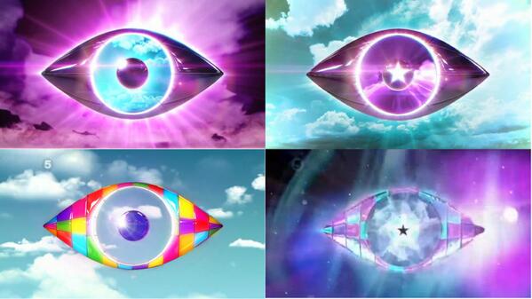
For comparisons... The eye looks so similar... It's unreal. However I do agree that the Eatock logo is overrated. The BB6 logo for example is just two eyes layered over each other? The BB9/10 logos were the best because the template changed. |
There was a reason for that, it was made to represent the two faced personalities of certain housemates (cough Makosi cough) which was an extremely good idea and better than anything c5 have thought of.