FAQ |
Members List |
Calendar |
Search |
Today's Posts |
![]() |
|
Big Brother Designs (fan made) For all fan-made BB banners, adverts, logos etc. |
Register to reply Log in to reply |
|
Thread Tools | Display Modes |
|
![]() |
#1 | |||
|
||||
:')
|
10. Its time for a change
"This year, Big Brother producers are determind to make the tenth series of the reality series a huge success. The iconic eye template, which some would argue is key to BB's success, has been changed to a more youthful template. The series will be based at a new compound in South-East London, away from local residents, in a derelict plot of land. This will ensure more choices and capabilities for producers" I will hopefully be designing graphics, a house (ext. & int.) and right now I'm showing you the all new eye template. I will reveal the coloured logo and official typeface later! EYE TEMPLATE I have designed this eye on PowerPoint only, I know it won't be the best, but I am sure its modern and also a step in the right direction for Big Brother. ![]() What does everyone think? ![]() |
|||
![]() |
![]() |
#2 | ||
|
|||
Senior Member
|
Its alright. It looks abit plain though.
Like with the BB eyes there more like. One bit sticking out of there and there. But yours is alright. Looks kinda cartoony though. |
||
![]() |
![]() |
#3 | |||
|
||||
:')
|
Thanks Kornetto =]
Fair point. I know its simple, but I think when you see it in colour it sticks out a lot more in your mind. One thing about this new eye template is that its narrower than the old one, this one is more circular and less wide. |
|||
![]() |
![]() |
#4 | ||
|
|||
Senior Member
|
![]() Yeah i suppose with colour its more better. Lol |
||
![]() |
![]() |
#5 | ||
|
|||
Senior Member
|
I personally don't like the eye design but I'm sure your ideas are good.
|
||
![]() |
![]() |
#6 | ||
|
|||
Senior Member
|
Can't wait to see more of it
|
||
![]() |
![]() |
#7 | |||
|
||||
SIGH
|
I think its really original. And like Conor said in another thread, this year with the fan-made projects, the rule book has gone out the window.
I cant wait to see more! |
|||
![]() |
![]() |
#8 | |||
|
||||
:')
|
THE EYE
The colours used are very bright and colourful, and I think they suit a new style Big Brother. Hope you like it! ![]() |
|||
![]() |
![]() |
#9 | |||
|
||||
BURLESQUE
|
ew I hate it sorry.
|
|||
![]() |
![]() |
#10 | |||
|
||||
M C F L Y <3
|
I'm quite a fan of the template, but not keen on the coloured one :3
It's the green on it that doesn't do it for me :3 Everything else sounds great though ![]() |
|||
![]() |
![]() |
#11 | |||
|
||||
:')
|
Thanks for the comments all.
Shame its unpopular with a few of you, I personally like it. The colours used are meant to be bright, in your face and modern. The cartoon style is true, and when you see the adverts you'll see that - bright colours, abstract 2D shapes. |
|||
![]() |
![]() |
#13 | ||
|
|||
Senior Member
|
I think its different and i like it.
|
||
![]() |
![]() |
#14 | |||
|
||||
Senior Member
|
This is really good! I think it would be perfect though if you get rid of the little plus signs and paste it in front of a pic of a real pupil.
Good work! ![]() |
|||
![]() |
![]() |
#15 | |||
|
||||
:')
|
Thanks Conor, I'll be showing off the BBLB/BBBM eyes later and graphics too.
Heres just one example of the trailers: ![]() 
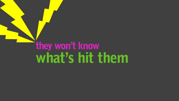
I won't be doing anymore but I just wanted to show the 'cartoony' abstract style of what the trailers would be like. For the moment though I really want to share some of the house with you! I only started it yesterday but I've done everything except the garden, bedroom and bathroom. 
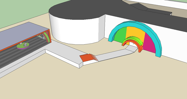
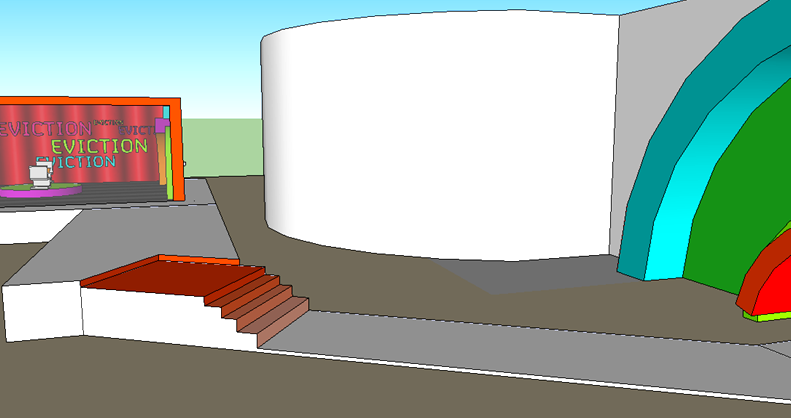
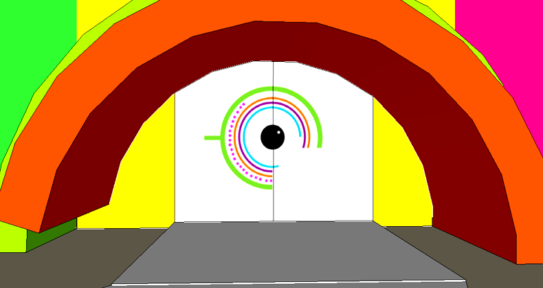
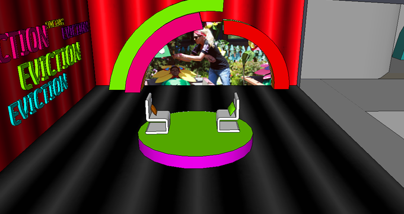
I'm going to show the house 'shell' and eviction studio today! The new house shell is longer and curvier. Its not TOO big, but its more higher which also enables for a bigger house height wise. The entrance is on the bottom floor, and the new interview studio is placed outside of the house in a glass box. The studio itself is quite small with just enough area for guests to stand.The glass box is a good idea and one I've always felt would work, as you would see the massive crowd outside but you wouldn't hear them booing or interrupting the interview as much. ![]() ![]() ![]() ![]() |
|||
![]() |
![]() |
#16 | |||
|
||||
Senior Member
|
Ooh i actually really like the fact that you've gone with something different. I like the coloured eye more than the non coloured one and i love the little entrance to the BB house with the eye on the door and stuff. Great work Josh, would be cool to see more
![]() |
|||
![]() |
![]() |
#18 | ||
|
|||
Senior Member
|
Ooh i love it, very colourful
![]() |
||
![]() |
![]() |
#19 | |||
|
||||
Senior Member
|
I'm not a fan of your eye design - black or in colour. There is two aspects of your studio design that I love though - the screen, and the big window looking out (I seem to remember C4 doing something like that for Grand Designs Live a year or so back).
Well done ![]() |
|||
![]() |
![]() |
#20 | ||
|
|||
Senior Member
|
The eye reminds me of Big Brohter Israel eye.
|
||
![]() |
![]() |
#21 | ||
|
|||
Senior Member
|
I love the eye!
|
||
![]() |
![]() |
#22 | |||
|
||||
Senior Member
|
I love the idea of a glass studio
![]() |
|||
![]() |
![]() |
#23 | ||
|
|||
Senior Member
|
Like the glass studio - always thought something like that could work if done well. BB5 for example would have been better off replacing the outdoor stage with a small studio, which only needs to be big enough for Davina, the evictee and a handful of guests (friends and family), plus the crew of course.
|
||
![]() |
![]() |
#24 | |||
|
||||
Senior Member
|
I like the eye template but the colour hurts my eyes ! Lol
Nice ideas youve got there though ! |
|||
![]() |
![]() |
#25 | |||
|
||||
Senior Member
|
Love your ideas
![]() |
|||
![]() |
Register to reply Log in to reply |
|
|