FAQ |
Members List |
Calendar |
Search |
Today's Posts |
![]() |
|
CBB20 Celebrity Big Brother Summer 2017 [CBB 20] was was won by Sarah Harding. Discuss the series and housemates here.
Housemates (tags):
|
Register to reply Log in to reply |
|
Thread Tools | Display Modes |
|
![]() |
#7 | |||
|
||||
-
|
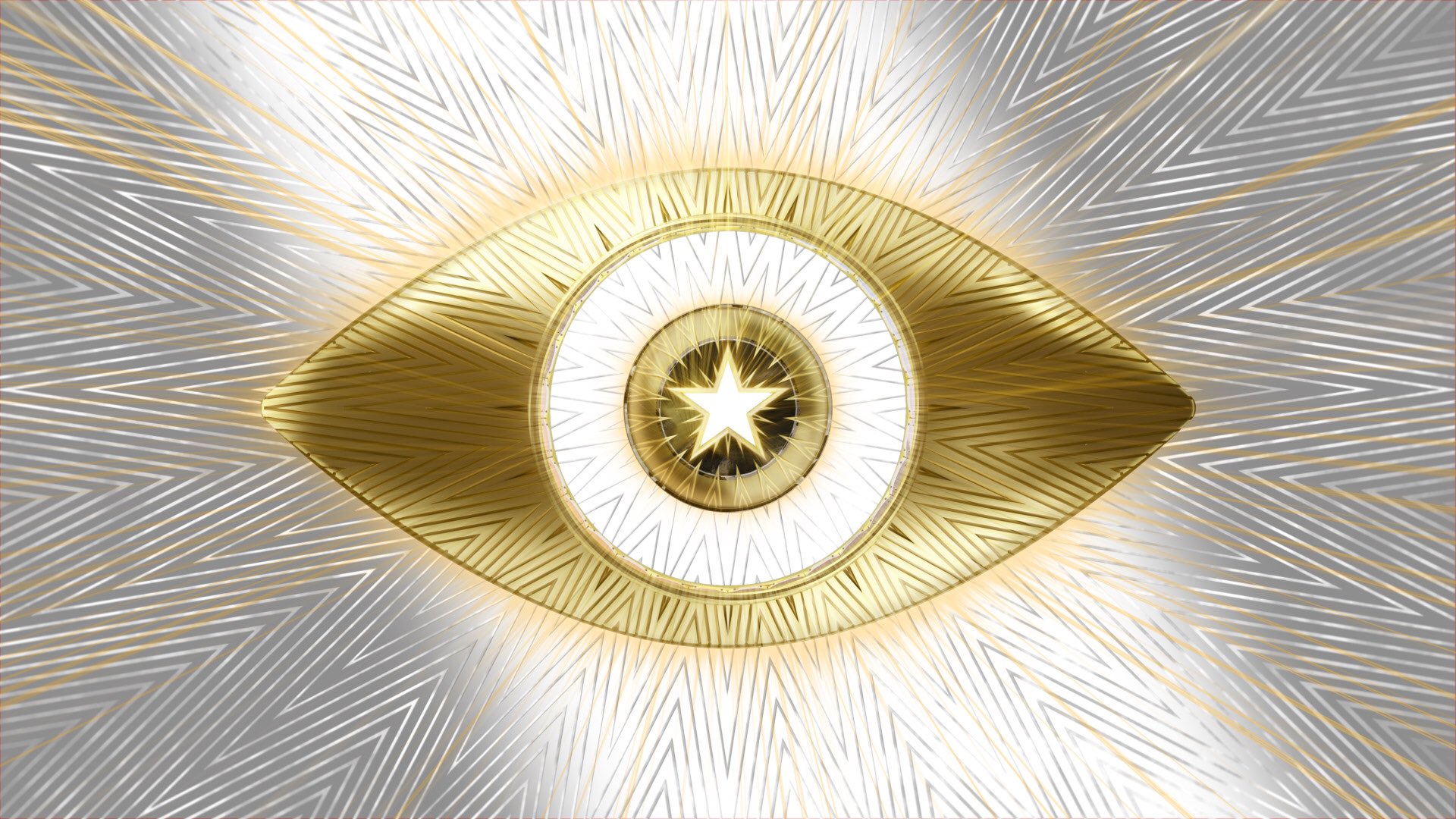
It looks plain and not in a good way.
|
|||
![]() |
![]() |
#8 | |||
|
||||
Senior Member
|
|
|||
![]() |
![]() |
#9 | |||
|
||||
Senior Member
|
Love it. Can't imagine how the village/ cottage theme can remain with that eye... we'll see!! Fingers crossed there's a good series coming our way!
|
|||
![]() |
![]() |
#12 | ||
|
|||
-
|
I don't know how to feel about it
It's as if they've tried to get the aesthetic of how BB's early eyes, notably BB3 and BB4, looked like, but they've still gone about it in a way that makes it look tacky with the outdated gloss and 3D-ism of the whole eye. It's a step in the right direction but they keep making the same mistakes. If it was a flat eye underneath that it would look better and it would make it folllow suit of the early series and then it would be basic in a GOOD way rather than this. They haven't gone about it very well. Eh. Last edited by T*; 19-07-2017 at 02:11 PM. |
||
![]() |
![]() |
#17 | |||
|
||||
-
|
|
|||
![]() |
![]() |
#21 | ||
|
|||
-
|
The fact C4 and Eatock would go out of their way to make sure the eyes were cutting edge, unique, and would stand out from the crowd and nowadays we get an afterthought of an eye is kinda sad tbh
|
||
![]() |
![]() |
#22 | ||
|
|||
Senior Member
|
does it really matter that much though? they went w a new design for C5, they will now be having a shortage of ideas, and tbh eyes like BB10 were hardly cutting edge and unique
|
||
![]() |
![]() |
#23 | ||
|
|||
-
|
Quote:
C5 don't have a shortage of ideas and there's still plenty of ideas they could be implementing. They just simply can't be arsed anymore, it's just cheap and cheerful. BB10 still has a good eye but I was more referring to the early era of BB where they eyes were unique, had a sort of illusion aspect and were almost hypnotic. Like, to most people, this eye is actually Green and Orange. It isn't, it's Cyan, Magenta and Yellow. It's an illusion. ![]() I actually find that really cool, it might seem sad for me to feel that way but it was clearly clever and well-thought out. If you don't think it's a big deal for yourself then... don't look at the eye when it's revealed |

||
![]() |
![]() |
#24 | |||
|
||||
Senior Member
|
Quote:
|
|||
![]() |
![]() |
#25 | ||
|
|||
-
|
Quote:
![]() There's nothing wrong with some consistency but even so they made all the branding different each time, nowadays we get timestamps shoved into the eye and have been doing for a long while. Channel 5 logos are tacky and tragic. I liked BB15 because they actually tried to spruce up the branding but the series it's affiliated with is trash. BB17 had a good eye but terrible graphics. It's all faux-glitzy and they've overloaded it with the font Gotham so much that it's basically a glittery turd branding wise. |
||
![]() |
Register to reply Log in to reply |
|
|