Hello. Firstly, Sketch-up has beaten me so they'll be none of that here - and my graphics design isn't too hot so it'll be more about giving you the general idea rather than wowing you with graphical wizardry.
That said though you will get a houseplan - and you will get a series outline - when it's ready! LOL
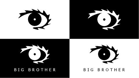
To start with though we have the eye. I've redesigned it and made it simpler - and a bit funkier IMO. It's also now just one solid shape - no extra eye-lashes down the bottom.
I want to move away from the idea of a new pattern each year - so the eye will be used differently throughout the promos and series itself. It's going a bit minimalist - a very simple eye in the centre of the screen.
Let's start with a couple of press shots - very simple, white on black or black on white - versions with and without the text.
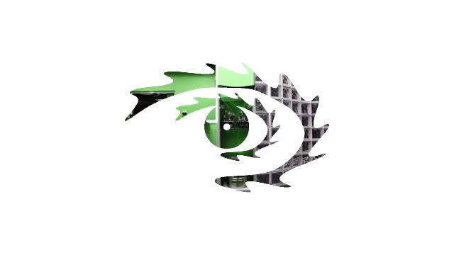
Next the eye flashes - the first time it's seen on screen. I want to move away from the traditional structure of the promo campaign, but the eye flashes will retain elements of it. Basically, again it's a very simple logo - but hidden behind it are sneak peaks of the house. It animates in a way similar to the Skins logo.

That's your lot for now - I've not been here long but I know the standard practise is too tease and milk these things as long as possible.
 Next: More shots of the eye in use


 03-05-2008, 11:02 PM

 Reply With Quote


 Threaded Mode