Firstly, let's look at the Channel 4 logo which hasn't changed at all (apart from the removal of colour in 1996) since 1982:
Obviously the idents have changed since then but the point here is that this is a well known logo, and the above animation was kept on screen for 14 years from 1982 to 1996. Not bad eh?
Now let's look at Channel 5's current logo which has changed no less than three times during the course of its much shorter 14 year history:
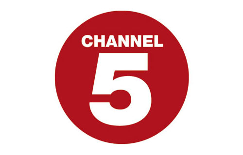
Now as you can see, even from the logos we can judge what channel is better than the other. Channel 4. Channel 5 even sometimes have to remind people that they're watching
'Channel' 5 and not just the number 5.
For further proof, just watch any of this week's Big Brother highlight shows, and you'll get the point.


 It just feels fresh and new in my opinion. Sorry if you dont agree


 Linear Mode

