| FAQ |
| Members List |
| Calendar |
| Search |
| Today's Posts |
|
|


Site Navigation
| Big Brother Designs (fan made) For all fan-made BB banners, adverts, logos etc. |
| Reply |
|
|
Thread Tools | Display Modes |
|
|
| Big Brother Designs (fan made) For all fan-made BB banners, adverts, logos etc. |
| Reply |
|
|
Thread Tools | Display Modes |
 11-09-2008, 06:50 PM
|
#1 | ||
|
|||
|
Senior Member
|
There are some talented people around here, but I'm getting rather tired off the usual mocks revamping the BB eye now. There are only so many things you can do with it - and after eight years I think most ideas have been exhausted.
So here's a challenge for you all - a brand new BB logo - to be designed if you were creating a logo from scratch. So it could be a new eye, but could be something completely different too - such as based on a house, camera, people etc - or just based around the title "Big Brother", as was the original logo. This is something I did a few months back which is just really a minor modification of the eye motif: 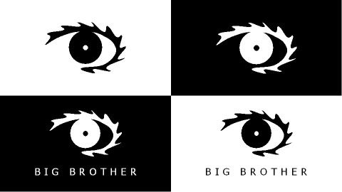 I think we can be a bit more ambitious than that and go for some more radical change. So the challenge is set - they'll be no prize, and no winner - but hey, BB9's finished and we're all bored! |
||

|
 Reply With Quote Reply With Quote
|
|
11-09-2008, 07:37 PM
|
#2 | |||
|
||||
|
Senior Member
|
   
|
|||
|
|
Reply With Quote
|
|
11-09-2008, 08:04 PM
|
#3 | |||
|
||||
|
Senior Member
|
Wow Conor they are amazing!
|
|||
|
|
Reply With Quote
|
|
11-09-2008, 08:21 PM
|
#4 | |||
|
||||
|
Senior Member
|
Conor reminds me of the O'neill logo;
But its really good. 
|
|||
|
|
Reply With Quote
|
|
11-09-2008, 09:07 PM
|
#5 | |||
|
||||
|
Senior Member
|
I wanna make one
 *Begins work* |
|||
|
|
Reply With Quote
|
|
11-09-2008, 09:08 PM
|
#6 | |||
|
||||
|
Senior Member
|
woooow conor, vvv unique!x
|
|||
|
|
Reply With Quote
|
|
11-09-2008, 09:32 PM
|
#7 | ||
|
|||
|
Senior Member
|
A very Endemol logo there Conor, though I think we can do better than slapping the text underneath in the C4 corporate font. Maybe it's time that went too - I'm sick of absolutely everything in the show being done in that font too!
|
||
|
|
Reply With Quote
|
|
11-09-2008, 09:52 PM
|
#8 | |||
|
||||
|
Senior Member
|
Mines.. OK.. I think.
 
|
|||
|
|
Reply With Quote
|
|
11-09-2008, 09:58 PM
|
#9 | ||
|
|||
|
Senior Member
|
Certainly eye catching - not sure about the red bit - might be better without it.
|
||
|
|
Reply With Quote
|
|
11-09-2008, 10:24 PM
|
#10 | |||
|
||||
|
Senior Member
|
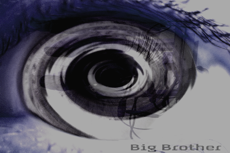
I think we've had enough "evil" BB logos now...time for something completely new.
|
|||
|
|
Reply With Quote
|
|
12-09-2008, 06:00 PM
|
#11 | ||
|
|||
|
Senior Member
|
Brekkie, i love your eyes.
Conor, I very like yours too! Reminds me of....the brighter pictures whatever logo, but still is nice! |
||
|
|
Reply With Quote
|
|
12-09-2008, 06:52 PM
|
#12 | |||
|
||||
|
Senior Member
|
I made a new one.. What do people think?

|
|||
|
|
Reply With Quote
|
|
12-09-2008, 07:18 PM
|
#13 | |||
|
||||
|
Senior Member
|
Quote:
|
|||
|
|
Reply With Quote
|
|
12-09-2008, 08:41 PM
|
#14 | ||
|
|||
|
Senior Member
|
Quote:
|
||
|
|
Reply With Quote
|
|
12-09-2008, 09:36 PM
|
#15 | ||
|
|||
|
Senior Member
|
Be smart if they made an eye out of all the past eyes
|
||
|
|
Reply With Quote
|
|
12-09-2008, 09:47 PM
|
#16 | ||
|
|||
|
Senior Member
|
Mine is inspired by two things really - our own logo from the first series, and the logo used by Gran Hermano in Spain and Grande Fratello in Italy.
The basic idea is it's a boxed logo which appears on it's own in print, and centred in the middle of the screen on TV. I've done two versions of it - the first I did was basically recolouring the BB1 eye and keeping the speckled effect: Logo:  Logo on screen: 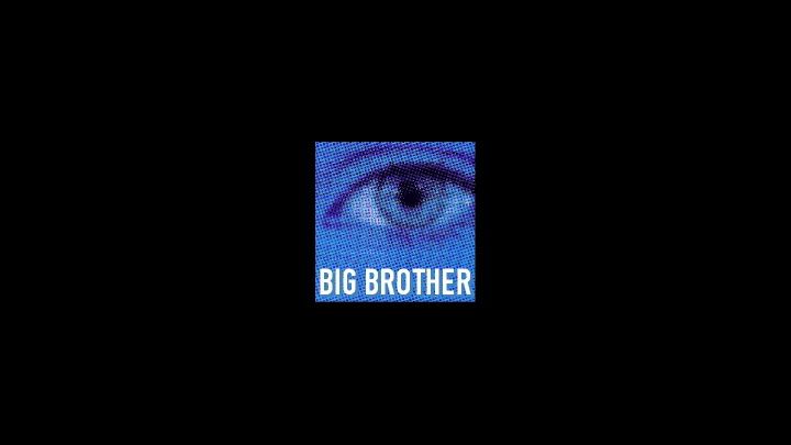 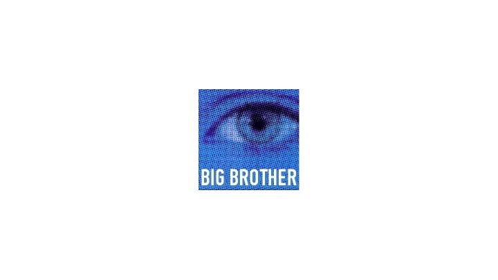 The second is a modification which is less speckled - can't decide which looks the best to be honest: Logo: 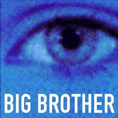 Logo on screen:  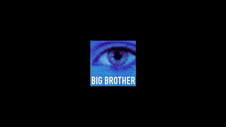
|
||
|
|
Reply With Quote
|
|
16-09-2008, 11:18 PM
|
#17 | ||
|
|||
|
Senior Member
|
I hope you guys haven't all been raised on the principle that if you've got nothing good to say, say nothing at all!

|
||
|
|
Reply With Quote
|
|
17-09-2008, 03:01 AM
|
#18 | ||
|
|||
|
Senior Member
|
i love your work !
|
||
|
|
Reply With Quote
|
|
20-09-2008, 12:09 AM
|
#19 | |||
|
||||
|
Member
|
Mine's three layers and has a camera with a twisted and a normal eye.
|
|||
|
|
Reply With Quote
|
|
20-09-2008, 01:54 PM
|
#20 | ||
|
|||
|
Senior Member
|
I like the idea geoking but I think it's a bit too stylised in some ways. Certainly an idea to run with though - but probably needs simplifying a bit so in time it would be instantly recognisable as the BB logo.
|
||
|
|
Reply With Quote
|
| Reply |
|
|


 Linear Mode

