| FAQ |
| Members List |
| Calendar |
| Search |
| Today's Posts |
![]() |
|
| Graphics Showcase your graphics here, get tips from other members or take part in TiBB graphic contests! |
| Register to reply Log in to reply |
|
|
Thread Tools | Display Modes |
|
|
|
|
#1 | ||
|
|||
|
Senior Member
|
Quote:
|
||
|
|
|
|
#2 | ||
|
|||
|
Senior Member
|
Quote:
|
||
|
|
|
|
#3 | |||
|
||||
|
ylvis♥
|
Quote:
I quite like the effects though. |
|||
|
|
|
|
#4 | ||
|
|||
|
Senior Member
|
Quote:
|
||
|
|
|
|
#5 | |||
|
||||
|
ylvis♥
|
new sig. <3
|
|||
|
|
|
|
#6 | ||
|
|||
|
Senior Member
|
Thats well nice.
|
||
|
|
|
|
#7 | |||
|
||||
|
Senior Member
|
Quote:
|
|||
|
|
|
|
#8 | |||
|
||||
|
Senior Member
|
&Scampi, your banner is so much better when the text is set to normal. Looks so much more.. tied together.
|
|||
|
|
|
|
#9 | ||
|
|||
|
Senior Member
|
Quote:
|
||
|
|
|
|
#10 | |||
|
||||
|
ylvis♥
|
Thankyou both
|
|||
|
|
|
|
#11 | ||
|
|||
|
Senior Member
|
Another Christmassy banner, what you lot think??
|
||
|
|
|
|
#12 | |||
|
||||
|
Senior Member
|
Quote:
Still a brilliant sig!
|
|||
|
|
|
|
#13 | ||
|
|||
|
Senior Member
|
Quote:
|
||
|
|
|
|
#14 | ||
|
|||
|
Senior Member
|
Not as sharp:
|
||
|
|
|
|
#15 | |||
|
||||
|
Piertotum Locomotor
|
WOW! Sarah that is seriously amazing, I love it so much. Scampi that is quite nice but it looks dark, over-sharpened and a tad dull, sorry.
|
|||
|
|
|
|
#16 | |||
|
||||
|
Senior Member
|
New banner;;
![]() Thoughts? EDIT: Sarah -- WOW - enough said. Scampi -- I really dislike both of those banners, I hate the font and the fact you can barely see her in the first and the second texture makes it all blurry and weird. 
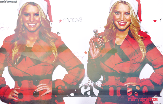
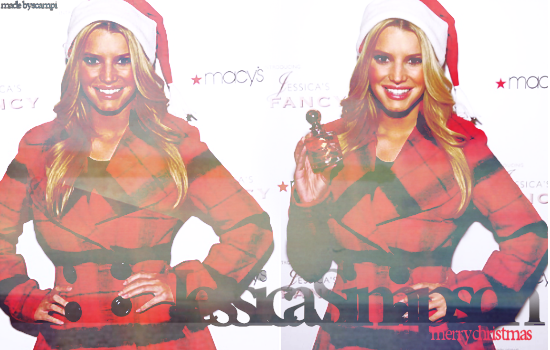
I do usually love yours though.
|
|||
|
|
|
|
#17 | |||
|
||||
|
Piertotum Locomotor
|
Love that Hugo, the cutting has been done so well and I like the purple flames. I love the effect the 'Reach Out' text in the background has, but I'm not fond on the 'Hilary Duff' font sorry.
|
|||
|
|
|
|
#18 | |||
|
||||
|
Senior Member
|
Scampi - I really like the smooth version of your new banner
Hugo - i dont like the large torso in the background. |
|||
|
|
|
|
#19 | |||
|
||||
|
Senior Member
|
Quote:
![]() && its the Blackout font.
|
|||
|
|
|
|
#20 | ||
|
|||
|
Senior Member
|
Which set do you lot prefer?
![]() ![]() ![]() ![]() ![]() or ![]() ![]() ![]() ![]()
|
||
|
|
|
|
#21 | |||
|
||||
|
Senior Member
|
Quote:
|
|||
|
|
|
|
#22 | |||
|
||||
|
Senior Member
|
Quote:
|
|||
|
|
|
|
#23 | ||
|
|||
|
Senior Member
|
Quote:
|
||
|
|
|
|
#24 | |||
|
||||
|
Senior Member
|
newsigright.
simple. temp. oversharpened. |
|||
|
|
|
|
#25 | |||
|
||||
|
Senior Member
|
Your new banner - LUSH.
Oversharpened but in a good way. ![]() Banner I made for Jen;;
|
|||
|
|
| Register to reply Log in to reply |
|
|