| FAQ |
| Members List |
| Calendar |
| Search |
| Today's Posts |
|
|


Site Navigation
| Tech, Movies & Video Games Discuss technology, movies and video games here. |
| Register to reply Log in to reply |
|
|
Thread Tools | Display Modes |
|
|
| Tech, Movies & Video Games Discuss technology, movies and video games here. |
| Register to reply Log in to reply |
|
|
Thread Tools | Display Modes |
 20-04-2011, 08:45 PM
|
#1 | |||
|
||||
|
ॐ❤✌❤ॐ❤☯❤ॐ❤✌❤ॐ
|
The list of the 10 best and worst design's of the 5th Generation of Pokemon.
This is only my opinion. Best Design's! #10 Galvantula 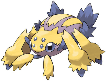 I love Galvantula's design. When Galvantula's backsprite was first seen, the internet went overboard with fans creating fake images of what they thought Galvantula might look like from the front, and frankly they were all ****e. Luckily though, Galvantual turned out better than i expected with cute lilac eyes and fluffy legs. Also its nice to see an Electric/Bug type  #9 Vanilluxe 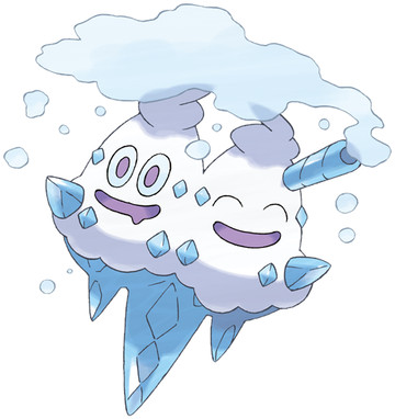 Yum! Delicious looking ice-cream Pokemon is just what we needed and we did! In the form of Vanilluxe and its evo line (Vanillite -> Vanillish -> Vanilluxe). Vanilluxe was actually designed by an American artist, not the usual Ken Sugimori. What I like the most about this pokemon is how its made completely out of ice, including the cone which would have looked terrible had it been designed with the usual beige colour. Beside's, how can you not love such adorable faces  #8 Crustle  The thing I love about Crustle is how it has different rock layers as its shell/body. It really makes it looks like part of a moving rock which is cool Im not sure if Crustle's rock shell is perminant or if it can be removed the same as its pre-evolution (Dwebble)'s can. Although I would probably not use Crustle in battle because rock types tend to suck, I still think its design is great!#7 Reuniclus 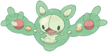 Im not quite sure what Reuniclus is based upon, I think its suppose to be cell's of some sort but whatever it is, its an amazing design and I image it will look great in the 3D wii games. Reuniclus is also strong in battle so it looks cute and can win ;D yay #6 Volcarona  Now im a sucker for moth pokemon I admid :/ I love Venomoth, Masquerain and Mothim so its obvious I would love Volcarona aswell. Sugimori said he designed Volcarona around the sun. The dark spots on its wings are meant to symbolise the dark spots in the sun ...which is kinda cool I guess ;/ Anyway, Volcarona is an amazing Pokemon in battle, with the combination of Fire and Bug type it makes a hard opponent! #5 Chandelure How on Earth can you resist something so cute! I love the whole evo line of Chandelure, (Litwick -> Lampent -> Chandelure). The name ChandeLURE just sound so creepy and elegant I have a Chandelure on my team in Pokemon White and it makes a good opponent for the enemy! #4 Gothitelle 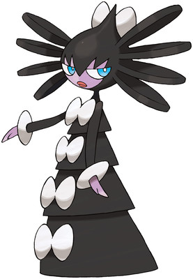 This Pokemon was the hardest to place in the top 10 because this is my favourate Pokemon of Generation 5! I loooove her and her design (although it can actually still be a boy, weird?) I think Gothitelle and its evo-line are adorable and fierce! I like all the feminine looking Pokemon such as Jynx and Gardevoir, so Gothitelle fits in as a kind of goth friend for them :s Anywho, its a great design and it can put up a good fight. #3 Hydreigon  I love this creepy bitch! Although its a Dark/Dragon type, I still think it looks like a ghost! As if the creepy head on its neck isnt enough, it also has two more heads on its arms! This Pokemon's pre-evo does not evolve into it untill level 64, which is the highest level for any other Pokemon. But its well worth it if you get to use one of these Pokemon in battle #2 Mandibuzz  I know this ones gonna be Controversial but I dont care because I think the design of Mandibuzz is amazing Ive wanted there to be a vulture pokemon for a long time and now we finally have one ;D its not really what I expected but I think its better! My Mandibuzz in Pokemon Black is a big powerhouse on the team. If given the right attacks, Mandibuzz can be a huge threat to the opposision  (Before her English name was revealed, fans nicknamed her Vulgina, kinda suits her though dont you think?) (Before her English name was revealed, fans nicknamed her Vulgina, kinda suits her though dont you think?)#1 Cofagrigus  My number one best Pokemon design has to be Cofagrigus! Ive aaaaalways wanted an egyption sarcophagus Pokemon and Cofagrigus is better than I ever would have expected The patterns on its body are great but the only fault with Cofagrigus is that its not part Ghost type :/ just 100% Ground type which kinda sucks. But that doesnt matter because Cofagrigus is still an amazing Pokemon and would make a good member to any team Worst Design's! #10 Yamask 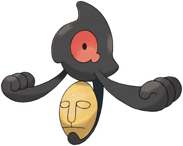 Suprisingly, the pre-evo of the number 1 best design is on the worst design list. Well as you can see Yamask looks nothing like Cofagrigus and should be ashamed to even be a Pokemon. To be honest it looks like a last minute attempt to quickly give Cofagrigus an evolution. Yamask looks cheap and tacky and is a waste of space on the PokeDex. #9 Timburr  Another waste of space in the PokeDex is this Pokemon, Timburr. This Pokemon I guess was suppose to replace Machop and its evolution line from Gen 1, however Timburr and its evolution like look discusting, but more on them later. #8 Swoobat  Swoobat is the evolved form of the adorable Woobat. Unfortinatly though Woobat goes through a bad case of puberty when it evolves into Swoobat :/ For starters, its tail looks like a rats tail and the claw-like thing at the end is just creepy. Secondly, its eyes are to big and wide. Woobat's eyes were covered with fluffy fur so they cant be seen, however Swoobat has its eyes big and open and all in all just looks crap. #7 Druddigon 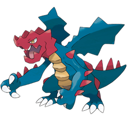 Okay now this Pokemon is completely pointless. Not only it is ugly but it looks like something a 10 year old drew and sent in to see if it could be made into a Pokemon :/ Its so pointless that I cant even be botherd to say why I dont like it, I just dont. #6 Heatmor 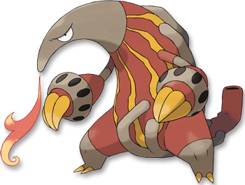 The idea of an firebreathing anteater Pokemon was amazing! But seriously..this is all they can come up with? Suuuuurely they could have come up with a better design than a weird floppy headed thing with pipes up its arse. This Pokemon is suppose to be 1 half of a gimmick with another Pokemon, Durant (a steel/bug type ant) but somehow they managed to turn a Pokemon with use potensial into a firebreathing worm thing. Not good >:/ #5 Klinklang 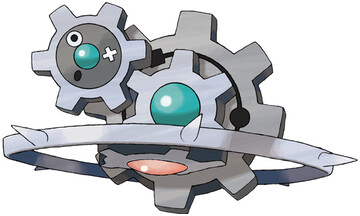 Klink, had what it took to be a good Pokemon. Klang didnt. But Klinklang certainly didnt! This Pokemon is such a bad idea, its basically Klink with a couple more gears attached! Its a total waste of idea and should never have been made into a Pokemon. #4 Tornadus/Landorus/Thundurus  These 3 weather god things are legendary Pokemon :/ They dont look like legends however, they look like crap. They dont even look like Pokemon, they look like 3 butch men in a gang. The idea for these 3 was a total waste, they could have a made a whole new 3 Pokemon evolution line, but no. They made these 3. #3 Gurdurr 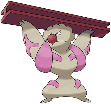 Following on from Timburr we have its evolution Gurdurr. The reason I hate Gurdurr is because it has a stupid clown nose AND weird pink muscles AND has an annoying metal bar thing AND has a bumpy head which looks like granny hair AND its yet another waste of potensial for another perfectly good Pokemon. #2 Conkeldurr  To round up the 'urr' evolution line we have Conkeldurr. The ugliest Pokemon of Generation 5. Conkeldurr may be good in battle but it just looks horrible. The clown nose is still there and still annoying, however this time he's not holding an annoying metal bar, no, hes holding two even more annoying ugly grey pillers of concrete ...WHY? btw this bearded thing can also be a female :/ #1 Seismitoad  Urgh, dont get me started on this ugly son of a bitch. For starters it looks like its diseased and dying. For seconds it vibrates! Who wants an ugly dying vibrating toad? This Pokemon is actually so dissapointing it makes me think that Sugimori is losing his touch if he's drawing **** like this :/ I mean c,mon! Anyway thats that hope you liked it
__________________
  Spoiler: Last edited by Saph; 20-04-2011 at 08:47 PM. |
|||

|
| Register to reply Log in to reply |
|
|


 Threaded Mode