FAQ |
Members List |
Calendar |
Search |
Today's Posts |
|
CBB20 Celebrity Big Brother Summer 2017 [CBB 20] was was won by Sarah Harding. Discuss the series and housemates here.
Housemates (tags):
|
Reply |
|
Thread Tools | Display Modes |
19-07-2017, 02:29 PM | #26 | ||
|
|||
-
|
Quote:
C5 don't have a shortage of ideas and there's still plenty of ideas they could be implementing. They just simply can't be arsed anymore, it's just cheap and cheerful. 
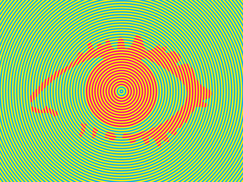
BB10 still has a good eye but I was more referring to the early era of BB where they eyes were unique, had a sort of illusion aspect and were almost hypnotic. Like, to most people, this eye is actually Green and Orange. It isn't, it's Cyan, Magenta and Yellow. It's an illusion. I actually find that really cool, it might seem sad for me to feel that way but it was clearly clever and well-thought out. If you don't think it's a big deal for yourself then... don't look at the eye when it's revealed |
||
Reply With Quote |
19-07-2017, 02:30 PM | #27 | |||
|
||||
Senior Member
|
Does this eye confirm it's All-Stars, judging by how gold-plated it is?
|
|||
Reply With Quote |
19-07-2017, 02:32 PM | #28 | |||
|
||||
Senior Member
|
Quote:
|
|||
Reply With Quote |
19-07-2017, 02:34 PM | #29 | |||
|
||||
Senior Member
|
|
|||
Reply With Quote |
19-07-2017, 02:35 PM | #30 | |||
|
||||
Senior Member
|
|
|||
Reply With Quote |
19-07-2017, 02:37 PM | #31 | |||
|
||||
beyonce of waltham forest
|
Bring back BB13 coloured square eyes
|
|||
Reply With Quote |
19-07-2017, 02:38 PM | #32 | |||
|
||||
Senior Member
|
Presenter pics look good but they're still embargoed - they've used the same shots of Emma and Rylan from before bbuk though.
|
|||
Reply With Quote |
19-07-2017, 02:39 PM | #33 | |||
|
||||
Senior Member
|
I like it, it's plain but at least it isn't tacky
__________________
|
|||
Reply With Quote |
19-07-2017, 02:40 PM | #34 | ||
|
|||
-
|
Quote:
There's nothing wrong with some consistency but even so they made all the branding different each time, nowadays we get timestamps shoved into the eye and have been doing for a long while. Channel 5 logos are tacky and tragic. I liked BB15 because they actually tried to spruce up the branding but the series it's affiliated with is trash. BB17 had a good eye but terrible graphics. It's all faux-glitzy and they've overloaded it with the font Gotham so much that it's basically a glittery turd branding wise. |
||
Reply With Quote |
19-07-2017, 02:41 PM | #35 | |||
|
||||
like the boys
|
Well it isn't what I was expecting
|
|||
Reply With Quote |
19-07-2017, 02:46 PM | #36 | ||
|
|||
Senior Member
|
Quote:
It's just that... I disagree with you. C5 have had some very creative eyes, particularly BB14-16, which were well-thought out and tied in with the theme and series, and 13 and 17 were at least beautiful and aesthetically pleasing. |
||
Reply With Quote |
19-07-2017, 02:47 PM | #37 | ||
|
|||
Senior Member
|
|
||
Reply With Quote |
19-07-2017, 02:49 PM | #38 | |||
|
||||
Lisa Scott-Lee Expert
|
It's a bit basic, I prefer Jarrod's eyes.
|
|||
Reply With Quote |
19-07-2017, 02:50 PM | #39 | |||
|
||||
TiBB’s Very Finest
|
I like it but prefer BB18’s tbh
__________________
I am TiBB’s BEST member as voted for by me Xx |
|||
Reply With Quote |
19-07-2017, 02:51 PM | #40 | |||
|
||||
Senior Member
|
|
|||
Reply With Quote |
19-07-2017, 02:52 PM | #41 | ||
|
|||
Senior Member
|
|
||
Reply With Quote |
19-07-2017, 02:52 PM | #42 | |||
|
||||
-
|
I really like it. Nice and simplistic compared to how "busy" some of the recent eyes have been
|
|||
Reply With Quote |
19-07-2017, 02:53 PM | #43 | |||
|
||||
Senior Member
|
|
|||
Reply With Quote |
19-07-2017, 02:54 PM | #44 | |||
|
||||
The Italian Job
|
I like it.
__________________
|
|||
Reply With Quote |
19-07-2017, 02:55 PM | #45 | ||
|
|||
-
|
Quote:
Theyve gone increasingly worse as time goes on, this year being a big example They don't care. |
||
Reply With Quote |
19-07-2017, 02:59 PM | #46 | |||
|
||||
Senior Member
|
|
|||
Reply With Quote |
19-07-2017, 03:00 PM | #47 | |||
|
||||
♡
|
I like it!
__________________
|
|||
Reply With Quote |
19-07-2017, 03:00 PM | #48 | |||
|
||||
TiBB’s Very Finest
|
Even though there’s only 4 days, the house could change a lot
BB17 and CBB18 only had 2 days between them, and that changed quite drastically tbh
__________________
I am TiBB’s BEST member as voted for by me Xx |
|||
Reply With Quote |
19-07-2017, 03:09 PM | #49 | |||
|
||||
Namaste
|
Quote:
I don't really agree, BB17 was only last year and that was one of my absolute favourite eyes including C4. And CBB8/ BB12 was their very first eye and that felt more like a placeholder template than a finished product so I definitely don't think it's a question of them starting well and getting worse over the years. Last edited by Lostie!; 19-07-2017 at 03:11 PM. |
|||
Reply With Quote |
19-07-2017, 03:21 PM | #50 | |||
|
||||
Senior Member
|
I disagree. Last years eye was my all time favourite, and they've definitely ALL been better than the first C5 eye. The fact this is only the second time they've ever given summer CBB it's own eye shows that if anything, they do care. It took C4 until the last series to give CBB its own eye! 4 months after the main series already used it every year!
|
|||
Reply With Quote |
Reply |
|
|