That's a really nice layout Ryan. I'm stuck with the vBulletin right now, but if that were added I would definitely change to your design.
Thanks Braden! Even if I can't work this into a theme somehow, Imma slip the theme slowly into the main site through the articles I write
__________________
Quote:
Remembering that you are going to die is the best way I know to avoid the trap of thinking you have something to lose. You are already naked. There is no reason not to follow your heart. -Steve Jobs
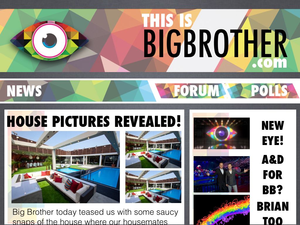
I like the design Ryan but there's one thing that bugs me about both of those images - the size of the font for details like 'Welcome _____' and the homepage headlines. They're way too chunky.
I do love the eye and the banners though.
__________________ Cad is gá dom a dhéanamh mura bhfuil mé ag bualadh leat?
Tá ceann folamh agam, yah, agus pearsantacht nua
Eirím níos dofheicthe, is tú imithe, ó mo shaol
Níl aon rud fágtha sa scátháin
An mbeidh mé álainn mhaol? Yeah
I see what you mean Shaun, I may tweak the design a bit later on if I get a chance :P
__________________
Quote:
Remembering that you are going to die is the best way I know to avoid the trap of thinking you have something to lose. You are already naked. There is no reason not to follow your heart. -Steve Jobs
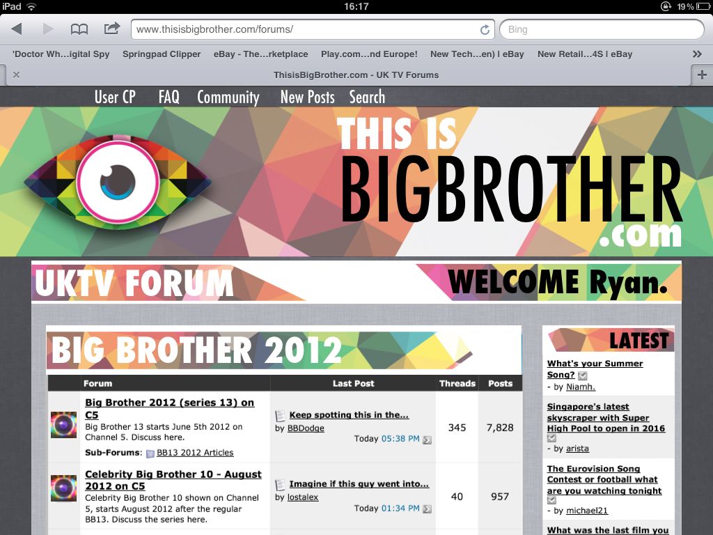
why should TiBB try to look like one of the fancy news blogs? We arn't a blog, we are a forum.
Oh poo you. People aren't gonna visit a 'forum', no matter how good, if the the first thing people see is a turd-ridden front page that looks like it has been time-sucked right out of 2003.
__________________
Quote:
Remembering that you are going to die is the best way I know to avoid the trap of thinking you have something to lose. You are already naked. There is no reason not to follow your heart. -Steve Jobs
The homepage layout is good as it is, it's just the actual design that's quite appalling.
__________________ Cad is gá dom a dhéanamh mura bhfuil mé ag bualadh leat?
Tá ceann folamh agam, yah, agus pearsantacht nua
Eirím níos dofheicthe, is tú imithe, ó mo shaol
Níl aon rud fágtha sa scátháin
An mbeidh mé álainn mhaol? Yeah
__________________ Cad is gá dom a dhéanamh mura bhfuil mé ag bualadh leat?
Tá ceann folamh agam, yah, agus pearsantacht nua
Eirím níos dofheicthe, is tú imithe, ó mo shaol
Níl aon rud fágtha sa scátháin
An mbeidh mé álainn mhaol? Yeah
Remembering that you are going to die is the best way I know to avoid the trap of thinking you have something to lose. You are already naked. There is no reason not to follow your heart. -Steve Jobs
I really like that idea, but it would mean a total rewrite of the forum, and I'm not sure it would be supported in VBulletin?
Looks class tho!
__________________
Quote:
Remembering that you are going to die is the best way I know to avoid the trap of thinking you have something to lose. You are already naked. There is no reason not to follow your heart. -Steve Jobs
you've just reminded me of Denise Welch and therefore I hate it
no it's k
__________________ Cad is gá dom a dhéanamh mura bhfuil mé ag bualadh leat?
Tá ceann folamh agam, yah, agus pearsantacht nua
Eirím níos dofheicthe, is tú imithe, ó mo shaol
Níl aon rud fágtha sa scátháin
An mbeidh mé álainn mhaol? Yeah
Remembering that you are going to die is the best way I know to avoid the trap of thinking you have something to lose. You are already naked. There is no reason not to follow your heart. -Steve Jobs
I really like your design Ryan, but agree with Shaun that the size and blocking of the type could do with some tweaking, but I think the site could do with something like that. I like your ideas too Samuel.
With all respect, the homepage looks very outdated and could do with a serious overhaul. It's not very eye catching (excuse pun) and should be interesting, not only in content, but also in the layout, as I am sure a lot of new members will be drawn to the news page first. They will want to find what they are looking for straight away, and navigation should be easy. There are other sites out there who have more appealing home pages.
Outdated polls and such like that have no meaning any more should be removed also as they make it seem as it has not been updated for a long time with obsolete information on there, and we are now only a couple of weeks away from the new series.
Last edited by Mrluvaluva; 26-05-2012 at 07:41 PM.
Ryan. that is stunning - looks so professional. The homepage would look a million times better with that design, font is a little too big for my liking but other than that it's brilliant. I really think admin should look into implementing your design as the homepage, I can't imagine it being too difficult to change it and the one we have now is horrid. It's been the same since I joined the forum and it hasn't grew on me at all over the years, hence why I rarely visit the main site.
I done a quick couple of designs a while back too, but if i'm remembering correctly then the front page is a cms addition to vbulletin so its kinda limited in design and layout and to get it looking like any of the designs posted here would take quite a bit of time/effort, if it was wp that was used for the main page or even just a webpage then it would be a whole lot easier to work with design wise but not for actual news articles and stuff from the forum.
Spoiler:
This was one I done last year so the font colours etc could be changed and the main banner could be changed with each new series.
The lorem ipsum writing is just filler text.
Spoiler:
This is one I came up with when I was messing around in PS, I was going for a kinda newspaper theme not too keen on it now though.
Remembering that you are going to die is the best way I know to avoid the trap of thinking you have something to lose. You are already naked. There is no reason not to follow your heart. -Steve Jobs
To be honest, if I was visiting the site for the first time, and I arrived at the homepage from a quick search, I wouldn't be impressed as it looked like it hadn't been updated in a long while until very recently. The eye logo should have been on there a while ago etc. Do the powers that be not think is needs a kick up the backside or are they not particularly bothered? Attitudes towards the home page seem to have been quite laxidasical for quite a while in terms of layout and content in my opinion.
Last edited by Mrluvaluva; 26-05-2012 at 08:37 PM.
I honestly think it's time more than anything else and not that they arent bothered, James basically has to do all that kind of stuff and lot's of other things by himself.
But yeah I would love to see the home page updated too.


 Linear Mode

