FAQ |
Members List |
Calendar |
Search |
Today's Posts |
![]() |
|
BB14 Channel 5's Big Brother: Secrets and Lies (aka Big Brother 14) started June 13th 2013 and was won by Sam Evans. Discuss the series and housemates here. |
Reply |
|
Thread Tools | Display Modes |
![]() |
#1 | |||
|
||||
that's Nice
|
ive got this strange thought that eatocks done the eye this year i dont think channel 5 are useing there template.
Last edited by JohnnyBB; 06-05-2013 at 02:19 PM. |
|||
![]() |
![]() |
![]() |
#2 | |||
|
||||
-
|
And why is that?
|
|||
![]() |
![]() |
![]() |
#3 | |||
|
||||
-
|
But tbf I have been imagining them using Eatock's template again
![]() |
|||
![]() |
![]() |
![]() |
#4 | |||
|
||||
Jemal
|
I doubt it because they incorporate it with channel 5 itself and it would be a whole different thing.
But if it's true I might just die, lol. |
|||
![]() |
![]() |
![]() |
#5 | |||
|
||||
Senior Member
|
The Eatock eye is overrated. Yeah I said it.
__________________
"Seeing Is Believing" |
|||
![]() |
![]() |
![]() |
#6 | |||
|
||||
folklore
|
__________________
![]() |
|||
![]() |
![]() |
![]() |
#7 | |||
|
||||
that's Nice
|
|
|||
![]() |
![]() |
![]() |
#8 | |||
|
||||
Senior Member
|
I agree! I kinda like the C5 eye.
__________________
|
|||
![]() |
![]() |
![]() |
#9 | |||
|
||||
-
|
Eatock's eye design>>>>> the BB13 eye>>>>>> the other **** which has come from BB on 5
|
|||
![]() |
![]() |
![]() |
#10 | |||
|
||||
-
|
I wouldn't mind as much if they removed the clouds/HM's faces from the titles. The reason I loved the first BB13 trailer so much was because of the background as well, looked really cool and retro. Then the actual titles came along, and we were back to clouds again. I just don't get why they are needed.
|
|||
![]() |
![]() |
![]() |
#11 | ||
|
|||
Senior Member
|
ThomasC can do the eye for all i care it really doesnt matter as long as C5 stop serving up the utter pish they have subjected us to since they sadly took over BBUK.
|
||
![]() |
![]() |
![]() |
#12 | |||
|
||||
Senior Member
|
I don't think they will, Eatocks eyes were amazing but BB has a new identity on C5
__________________
![]() ----------------------------------------------------------------------------- |
|||
![]() |
![]() |
![]() |
#13 | |||
|
||||
Jemal
|
Quote:
|
|||
![]() |
![]() |
![]() |
#14 | |||
|
||||
Senior Member
|
Your hair is incredible and I don't care about the Big Brother eye
__________________
![]() |
|||
![]() |
![]() |
![]() |
#15 | |||
|
||||
Senior Member
|
Hahahahaha, why thank you!
__________________
|
|||
![]() |
![]() |
![]() |
#16 | |||
|
||||
Senior Member
|
Quote:
There should be titles dedicated to the theme of the house and eye. |
|||
![]() |
![]() |
![]() |
#17 | |||
|
||||
Senior Member
|
|
|||
![]() |
![]() |
![]() |
#18 | |||
|
||||
that's Nice
|
Quote:
![]() Last edited by JohnnyBB; 06-05-2013 at 02:23 PM. |
|||
![]() |
![]() |
![]() |
#19 | |||
|
||||
V.I.P
|
LOL. 'i've got a gut feeling'.
It's just wishful thinking, we'll be stuck with a tacky design instead dw. Quote:
![]()
__________________
![]() |
|||
![]() |
![]() |
![]() |
#20 | |||
|
||||
V.I.P
|
How the **** is the Eatock design over rated.
In what world is this; ![]() Better than this; ![]()
__________________
![]() |
|||
![]() |
![]() |
![]() |
#21 | |||
|
||||
Senior Member
|
The Eatock design may be over rated but its still bloody brilliant.
What other TV show's logo is as iconic throughout the UK and Ireland? |
|||
![]() |
![]() |
![]() |
#22 | |||
|
||||
V.I.P
|
Quote:
The Eatock Design is on par with the EastEnders Theme Tune as one of those symbolic and iconic elements that instantly can be recognized throughout the country. Channel 5, IMO made a massive mistake in 2011 when they scrapped it - and we all know the only reason they got rid of the Eatock design was so they could fit their 'Channel 5 Logo' in the middle of the BB12 eye, because they thought it was cool and funky when it was just ugly. Channel 5 would of had a really easier job to do when promoting Big Brother, if they had of stuck to Eatock - as it was a design already well established and loved throughout the UK anyway, where as this new one.. no one really knows or cares about.
__________________
![]() |
|||
![]() |
![]() |
![]() |
#23 | |||
|
||||
that's Nice
|
the eye that never was but its soo ****ing gawjuss
![]() |
|||
![]() |
![]() |
![]() |
#24 | |||
|
||||
folklore
|
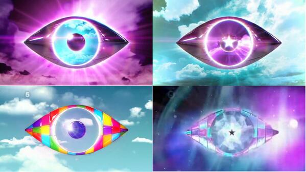
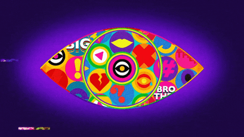
![]() For comparisons... The eye looks so similar... It's unreal. However I do agree that the Eatock logo is overrated. The BB6 logo for example is just two eyes layered over each other? The BB9/10 logos were the best because the template changed.
__________________
![]() |
|||
![]() |
![]() |
![]() |
#25 | |||
|
||||
V.I.P
|
Quote:
And the BB6 eye was simple - but effective. It also at least stayed true to the graphics of that series. Where as nowadays they don't. The BB7 Eye was also out of this world, and that was simple and effective. Channel 5 need to realise, you don't need to be 'out there' and as a flamboyant as Louie Spence to get noticed - you just need to have a simple design and a good way of going about promoting it and further designing it. I mean - that BB12 Eye that Johnny just posted there, it speaks to me so much. You can tell Mr Eatock was like 'Here you go guys, this is the eye - it's symmetrical, and slightly dark. I think Hello Charlie could make fantastic opening titles to go with this too.' And Jeff Ford was all, 'lol no we have better ideaz. ur not needed anym0re x'
__________________
![]() |
|||
![]() |
![]() |
Reply |
|
|