FAQ |
Members List |
Calendar |
Search |
Today's Posts |
![]() |
|
CBB8 Celebrity Big Brother 8 shown on Channel 5 from 2011. Discuss Channel 5 Celebrity Big Brother won by Paddy Doherty. |
Register to reply Log in to reply |
|
Thread Tools | Display Modes |
|
![]() |
#1 | |||
|
||||
V.I.P
|
Just watching this new advert made me realize how much I missed the old ones that revolved around the graphic design of the eye and they teased us abit before throwing the eye at us and stuff.
I mean, THIS is what you call a Big Brother Advert; I remember the excitement and boner I got when this came on TV for the first time one night. And does anyone think we will actually get a House Trailer? We haven't had one since 2008 so I don't know, but if we get one it might just be like this new eye's pupil being replaced by pictures of the house or something. 
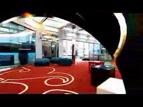
A perfect example of a house trailer that was done to perfection; I get shivers when I watch that trailer and it's from 2006 - I mean I didn't get that WOAH factor from Channel 5's advert at all? It was designed by Hello Charley, as is the eye and every other graphic aspect this year but it sucks. Hello Charley have always done an amazing job on the opening titles since BB6 onwards, ALWAYS - infact the only year they didn't was in 2010 with CBB7. So I expect the opening titles for this series will be the best ever seeing as they designed the eye, probably to fit their own titles.
__________________
![]() |
|||
![]() |
![]() |
#2 | |||
|
||||
V.I.P
|
__________________
![]() |
|||
![]() |
![]() |
#3 | |||
|
||||
BB9UK - Legendary Series.
|
Quote:
![]() ![]() ![]() But yeah I do prefer the old ones but the show needs change so there's not much they can do about it. I think people will grow to like the new adverts. ![]() |
|||
![]() |
![]() |
#4 | |||
|
||||
Senior Member
|
The only people who love BB9 and it's graphics are those who didn't watch the show before hand, while it was miles better than BB8 it was average compared to 5, 6, 7, even 10 (not including the first week and empty crowds).
|
|||
![]() |
![]() |
#5 | |||
|
||||
Senior Member
|
I prefer the new advert to the examples you've posted - at least there's slightly more to it than flashy graphics, as nice as they are.
Last edited by Matt; 23-07-2011 at 12:36 PM. |
|||
![]() |
![]() |
#6 | |||
|
||||
V.I.P
|
Oh I know, I mean that was the only year they weren't good titles in CBB7.
__________________
![]() |
|||
![]() |
![]() |
#8 | |||
|
||||
Senior Member
|
They do from a fan point of view, but the ads aren't there for us they're for casual viewers and non-viewers and the old cryptic ads with odd mixes of the theme that sometimes sound nothing like it to ocassional viewers and over the top, camp 3d spinning, rotating eyes don't pull them in, hints at what to expect do.
|
|||
![]() |
![]() |
#9 | |||
|
||||
It's lacroix darling
|
I think the problem with the Channel 5 ad is that the font they've picked makes it look cheap and tacky. I have no problem with the eye there at all, just the font.
I do agree though, the BB7, BB9 and BB5 ads were all done to perfection, I just hope Channel 5 will be able to keep to that standard.
__________________
![]() |
|||
![]() |
![]() |
#10 | |||
|
||||
Senior Member
|
Quote:
Last edited by DigitalSid; 23-07-2011 at 12:23 PM. |
|||
![]() |
![]() |
#11 | |||
|
||||
It's lacroix darling
|
Well it just looks tacky to me in that advert I don't know why. I actually really like the way the eye looks in the ad though however.
__________________
![]() |
|||
![]() |
![]() |
#12 | |||
|
||||
Senior Member
|
I think your just too sensitive to change (we all are, we've been analysing the show every summer since 2000). The C5 font while not a patch on the C4 font isn't that bad, it's part of the Helvetica set (which are generally considered to be some of the best) and once we're used to it, we'll be fine.
|
|||
![]() |
![]() |
#13 | |||
|
||||
V.I.P
|
Quote:
![]()
__________________
![]() |
|||
![]() |
![]() |
#14 | |||
|
||||
V.I.P
|
Quote:
The C5 Font looks identical to a font from a Pixar movie that was released a couple of years ago, I forget what it was lol.
__________________
![]() |
|||
![]() |
![]() |
#15 | |||
|
||||
It's lacroix darling
|
Quote:
![]()
__________________
![]() Last edited by Niall; 23-07-2011 at 12:41 PM. |
|||
![]() |
![]() |
#16 | |||
|
||||
V.I.P
|
Didn't we get that Daily Star shot though of the eye flash itself or something?
I don't think that was even shown on the advert - so there's bound to be more to come. Every BB usually has about 3 Adverts. So this one, then we might get another one - and then the official trailer with the ex housemates. Maybe a few of those futuristic eye flashes the Daily Star posted a picture of? And hopefully, a countdown to the launch - but we haven't had that since BB10 so I don't know if it'll happen or not, plus no one watches Channel 5 so it'd be rather pointless but still. Quote:
![]()
__________________
![]() |
|||
![]() |
![]() |
#17 | |||
|
||||
Senior Member
|
Quote:
|
|||
![]() |
![]() |
#18 | |||
|
||||
All hail the Moyesiah
|
Yeah the old C4 ones do look a lot more professional, I agree with Niall about the font on C5's advert, it does make the whole thing look a bit tacky and cheap
|
|||
![]() |
![]() |
#19 | ||
|
|||
Senior Member
|
Bloody hello, people on here are never happy. the show is back what the is wrong with people. the advert is good and exciting enough. To hell with the eye what does that matter !
|
||
![]() |
![]() |
#20 | |||
|
||||
CharlieO
|
Everything Patrick said is
![]() That channel 5 advert looks so bad. The only thing that is remotely good is Marcus Bentley's voice. Channel 5 has caused BB to lose the little class it retained. Goodbye BB. You are just a tacky mess now.
__________________
Spoiler: ME AND GOD WE DON'T GET ALONG, SO NOW I SING
|
|||
![]() |
![]() |
#21 | |||
|
||||
Senior Member
|
The whole show has lost it's class and become tacky because of a bloody 10 second advert? Really? Grow up.
|
|||
![]() |
![]() |
#22 | |||
|
||||
CharlieO
|
Yes it has in my opinion. The graphics and clearly well produced titles and graphics drew me to BB in the first place. The amazing high framed titles and adverts gave the show a sense that a lot of effort had been put in and no matter the cheap, low class tone the housemates brought to the house. At least it retained some through the production. And I don't need to grow up as it is my opinion. Settling for that disgrace of an eye is just pathetic, its s**t and everyone can see that.
__________________
Spoiler: ME AND GOD WE DON'T GET ALONG, SO NOW I SING
Last edited by CharlieO; 23-07-2011 at 12:58 PM. |
|||
![]() |
![]() |
#23 | |||
|
||||
Senior Member
|
Quote:
Quote:
Last edited by DigitalSid; 23-07-2011 at 01:01 PM. |
|||
![]() |
![]() |
#24 | |||
|
||||
CharlieO
|
Quote:
And I obviously also watch because I enjoy the concept of the show but on days where the housemates just make a show thats not enjoyable at all the titles and production kept me watching.
__________________
Spoiler: ME AND GOD WE DON'T GET ALONG, SO NOW I SING
|
|||
![]() |
![]() |
#25 | |||
|
||||
Senior Member
|
I thought I replied in here
![]() BB7 advert > new one without a doubt. But when new pics of house are revealed I'm sure the advert will be upgraded. |
|||
![]() |
Register to reply Log in to reply |
|
|