| FAQ |
| Members List |
| Calendar |
| Search |
| Today's Posts |
|
|


Site Navigation
| BB3 Chat about Kate, Alex, Jade Goody and anything to do with Big Brother 3! |
| Register to reply Log in to reply |
|
|
Thread Tools | Display Modes |
|
|
| BB3 Chat about Kate, Alex, Jade Goody and anything to do with Big Brother 3! |
| Register to reply Log in to reply |
|
|
Thread Tools | Display Modes |
 25-04-2011, 03:01 PM
|
#1 | |||
|
||||
|
V.I.P
|
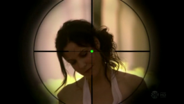
What a brilliant eye, definietly the best out of BB1-BB5.
 But look closer at it; Does anyone else see it differently? Like it looks very Irish and Green & Orange from the distance, but when you look closer I see that it turns Blue and the Orange becomes Pink? Did anyone else ever notice this? It may of been obvious on the opening titles back in 2002 for everyone.
__________________
 |
|||

|
|
25-04-2011, 03:02 PM
|
#2 | |||
|
||||
|
Skinny Legend
|
It's probably my least favorite eye :/
If I look at it too long everything goes fuzzy
__________________
 The scars on my mind are on replay |
|||
|
|
|
25-04-2011, 03:15 PM
|
#3 | |||
|
||||
|
legend
|
It's like an illusion.
 Or at least it feels like one. Yeah, this is one of my favourite eyes. |
|||
|
|
|
25-04-2011, 03:16 PM
|
#4 | |||
|
||||
|
I Love Niamhs Brick
|
This is one my favourite eyes too! Glad you are watching BB3 Patrick, was defo one of the best BB's to watch.

__________________
It's never too late to be who you once could have been... Spoiler: |
|||
|
|
|
25-04-2011, 03:30 PM
|
#6 | ||
|
|||
|
Pyramid*
|
Quote:
The spirals are blue and yellow - blue and yellow make green, hence the illusion. |
||
|
|
|
25-04-2011, 03:39 PM
|
#8 | |||
|
||||
|
legend
|
I only just realised it isn't green.
|
|||
|
|
|
25-04-2011, 04:04 PM
|
#9 | |||
|
||||
|
Hands off my Brick!
|
Oh, I thought it was green too, it's pretty cool, eventhough it makes me dizzy!
__________________
Spoiler: |
|||
|
|
|
25-04-2011, 04:23 PM
|
#10 | ||
|
|||
|
Senior Member
|
I liked it for what it was but it gives me a headache.
|
||
|
|
|
25-04-2011, 04:50 PM
|
#11 | |||
|
||||
|
King Judd
|
It's not thaaat amazing. I prefer the BB7 or 9 ones. Even the BB10 one is better for me.
__________________
Been here thirteen years, may not post much but when I do- the opinion counts, bow down bitches x
|
|||
|
|
|
25-04-2011, 05:13 PM
|
#12 | |||
|
||||
|
V.I.P
|
Quote:
I said it was the best out of BB1-BB5. Because the early eyes all sucked, especially BB5's. Obviously the BB7 and BB9 ones were better, those 2 Series come out on top everytime when it comes to most things. And the BB10 one is brilliant anyway. But out of the early seasons, this one is the best - infact it's probably better than BB6's eye aswell.
__________________
|
|||
|
|
|
25-04-2011, 06:54 PM
|
#13 | |||
|
||||
|
King Judd
|
Quote:
Yeah definatly better than BB6's.
__________________
Been here thirteen years, may not post much but when I do- the opinion counts, bow down bitches x
|
|||
|
|
|
25-04-2011, 07:08 PM
|
#14 | ||
|
|||
|
Senior Member
|
BB6's is my favourite. I think BB5's was a good idea with the sharp edges but executed all wrong.
Whenever I see the graphics for that series on youtube it looks so 90s and very dated. Last edited by Marsh.; 25-04-2011 at 07:08 PM. |
||
|
|
|
25-04-2011, 07:42 PM
|
#15 | |||
|
||||
|
Blue Waffle ¬_¬
|
The BB3 eye was orange and green on screen but in print form it's actually yellow, cyan (blue) and magenta (pink). See Eatock's site...
http://eatock.com/project/big-brother-3/ Btw I also really liked the CBB2 logo because CBB3-6 all simply have a star instead of a pupil but at least CBB2 took BB3's circle pattern and changed it in to a star. It's the most original CBB logo until CBB7's And BB5's my favourite of the BB1-5 eyes tbh. I hated when it was unveiled in black and white but soon as the red version came out I loved it. 
__________________
|
|||
|
|
|
21-08-2011, 01:34 PM
|
#16 | ||
|
|||
|
Member
|
This variation of the eye is quite clever. I was just about to point out the CMYK detail - that's what is so clever about it.
The celebrity one just gives me a headache though. I can hardly see the red eye in it - just the pain-inducing lines and star! It was a good variation though, rather than just sticking a star in the middle ruining the illusion. Although it's worth noting that for Celebrity Big Brother 2006, Daniel Eatock/Foundation 33 did create a similar variation of the eye, this time from series 6:  However it was rejected resulting in just the normal variation of putting a star instead: 
Last edited by VirginMediaPhil; 21-08-2011 at 01:35 PM. |
||
|
|
| Register to reply Log in to reply |
|
|


 Linear Mode

